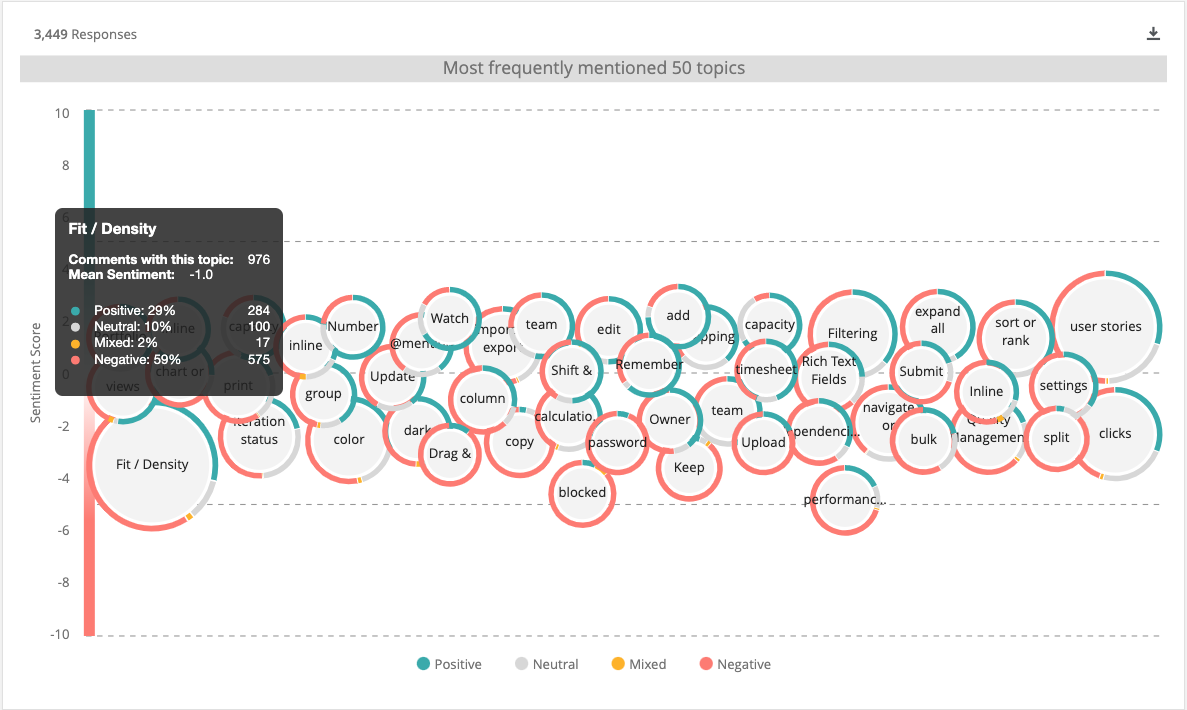
Launch of a new UI

Context

After Rally (CA Technologies) got acquired by Broadcom, the company faced numerous challenges including employee attrition and loss specialized talent, a new corporate strategy, etc. We were forced to abandon the new product strategy we had been working on.

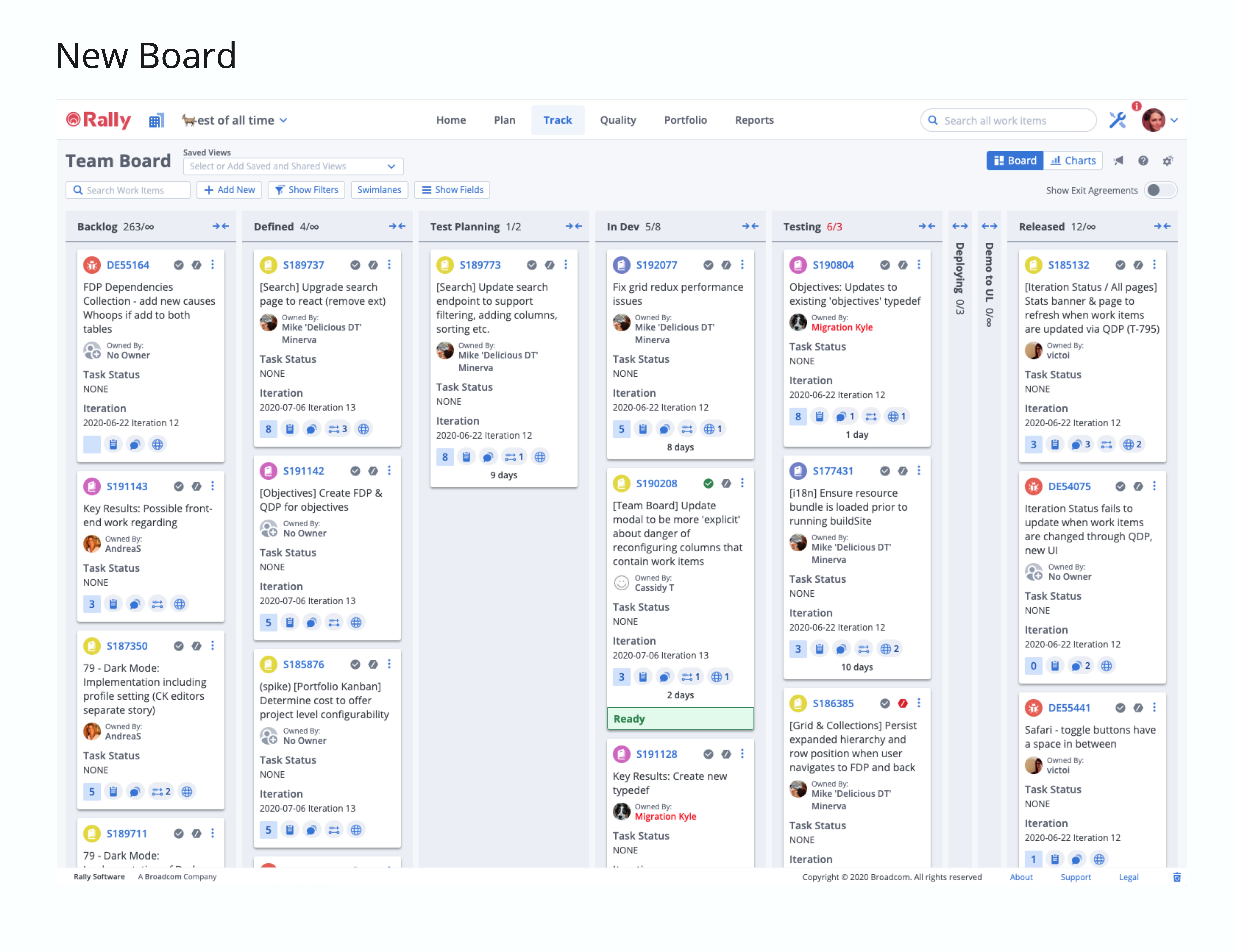
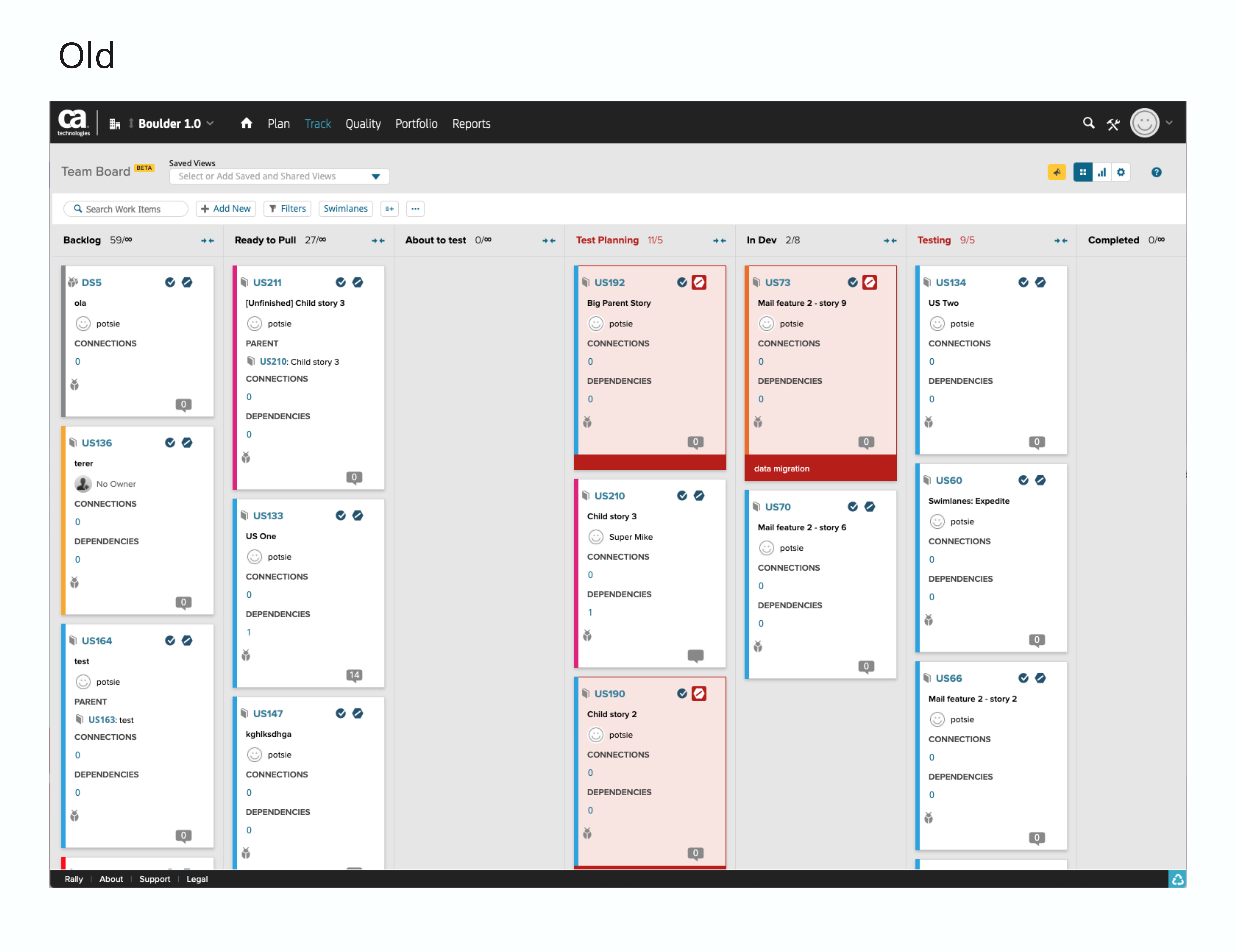
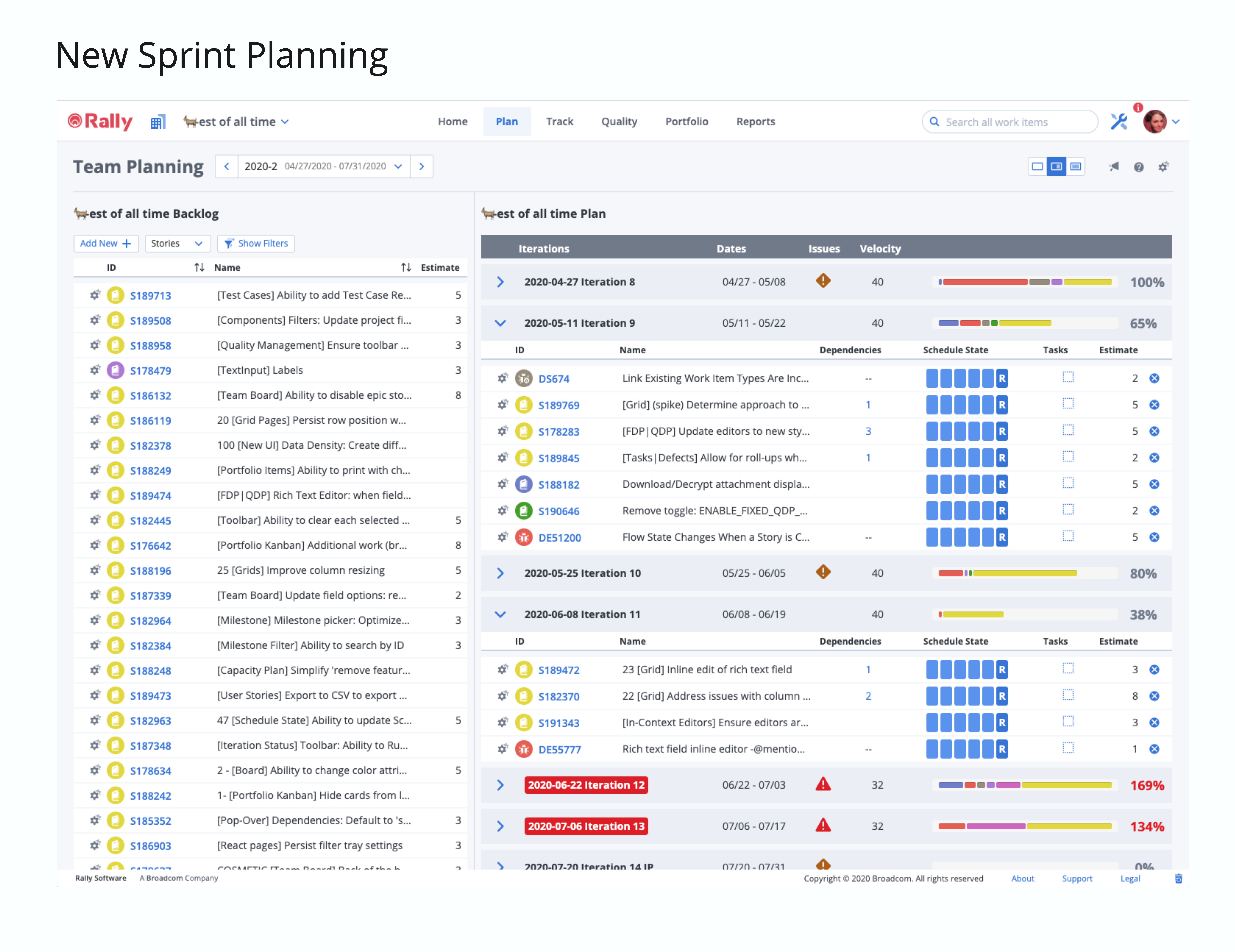
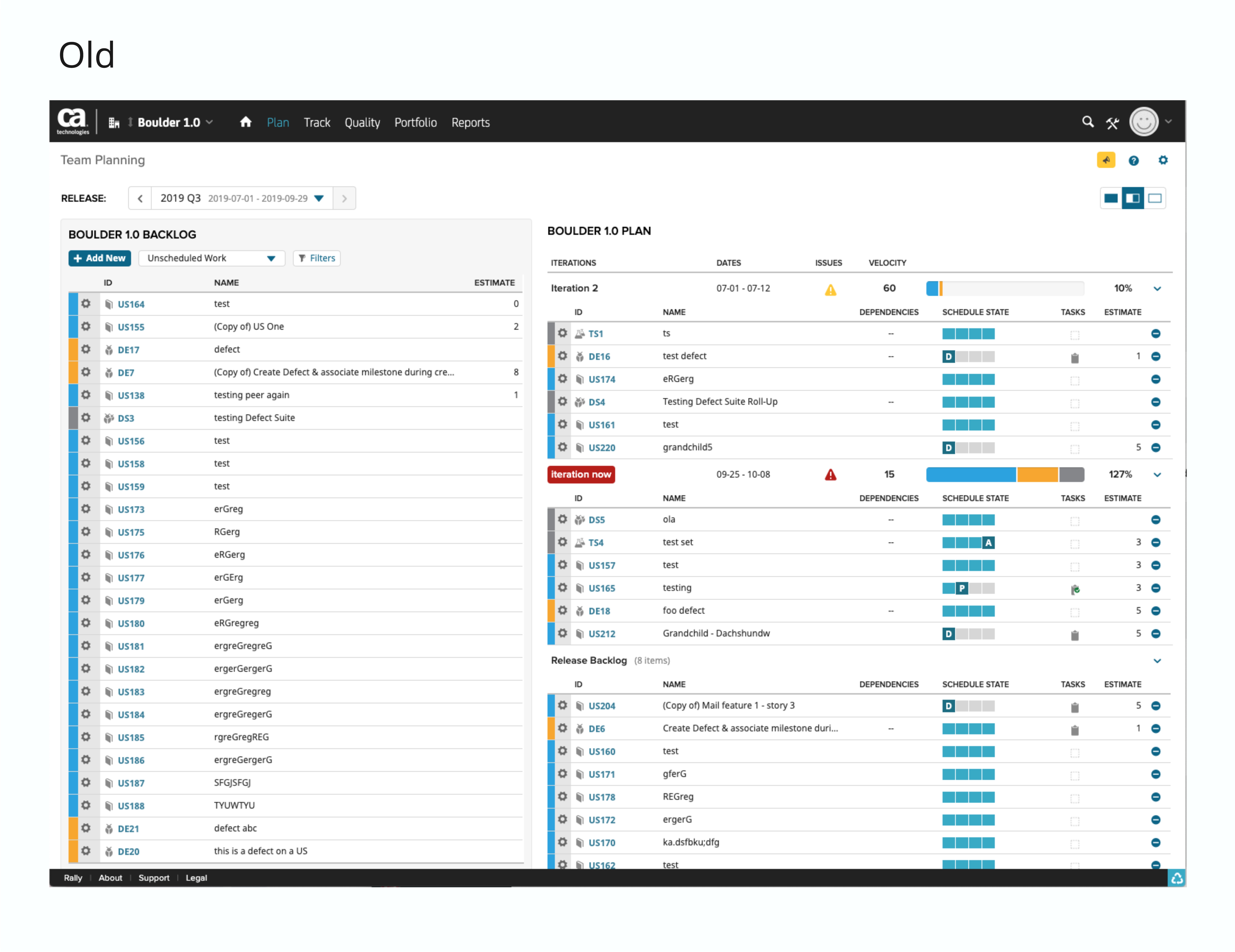
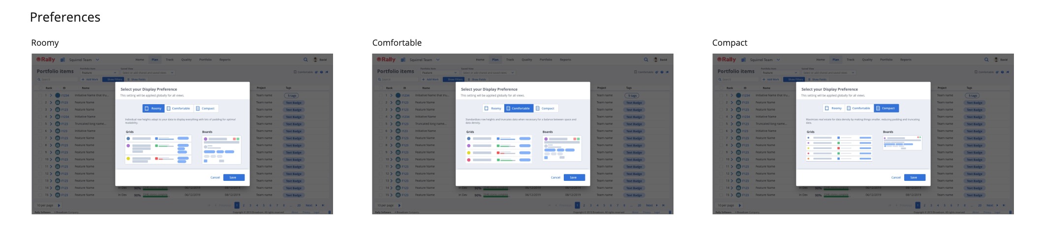
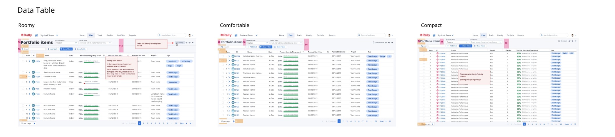
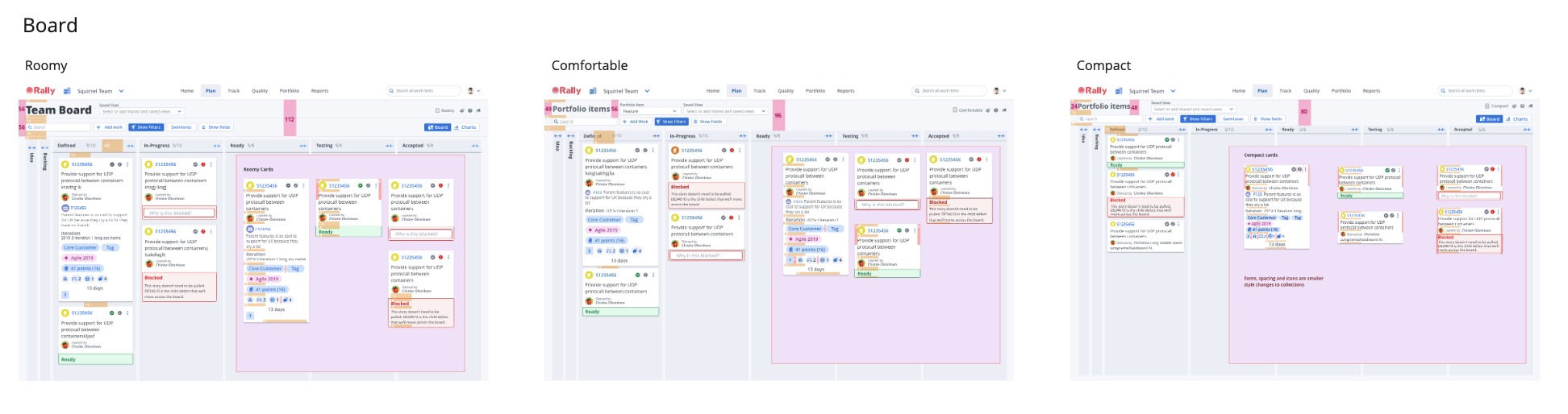
We had invested a year+ towards a new product, leadership was interested in salvaging as much of that work as possible. The decision was reached that we could deliver enough user value by giving Rally a face lift and in the meantime improve our tech stack, and provide a more consistent experience for our customers.

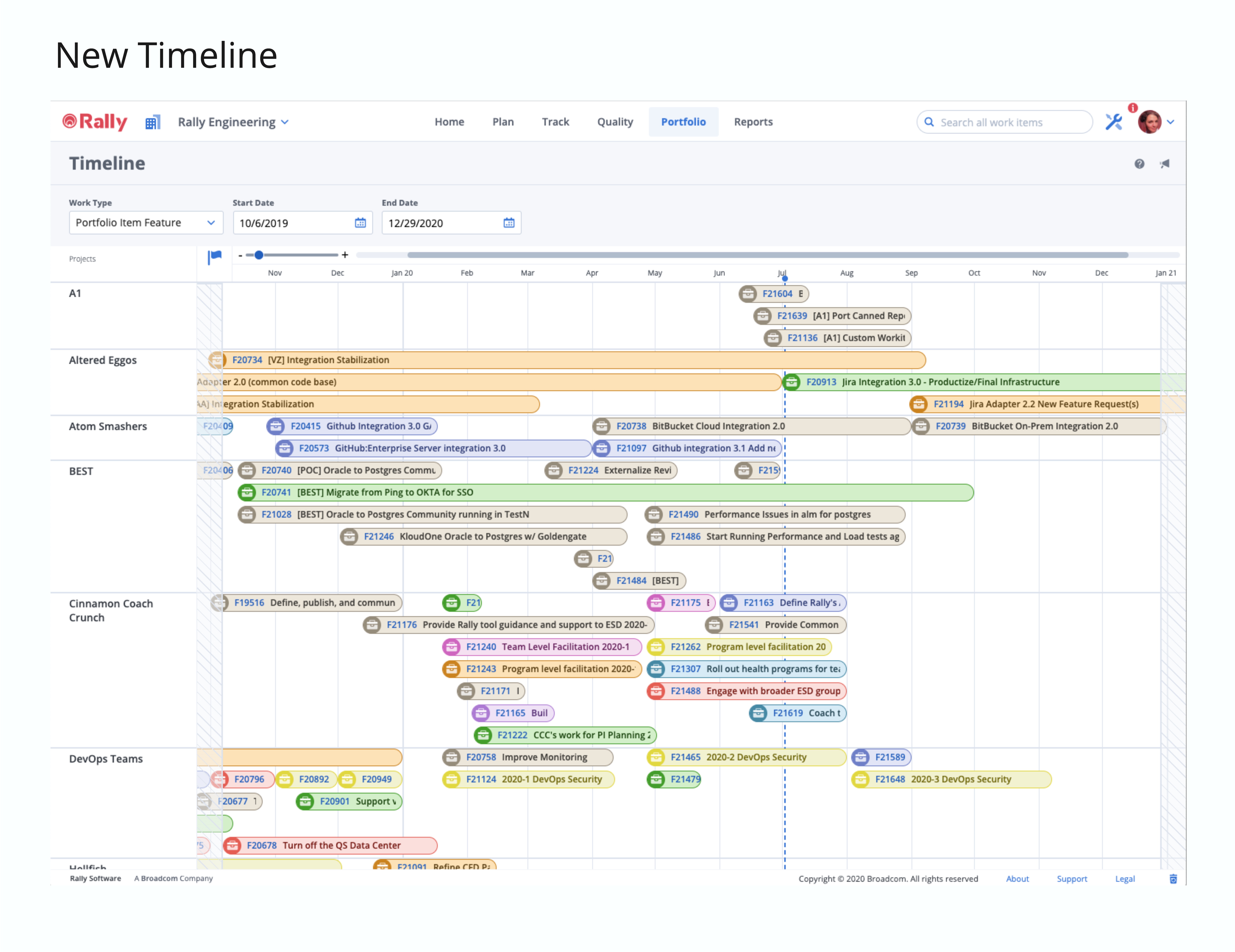
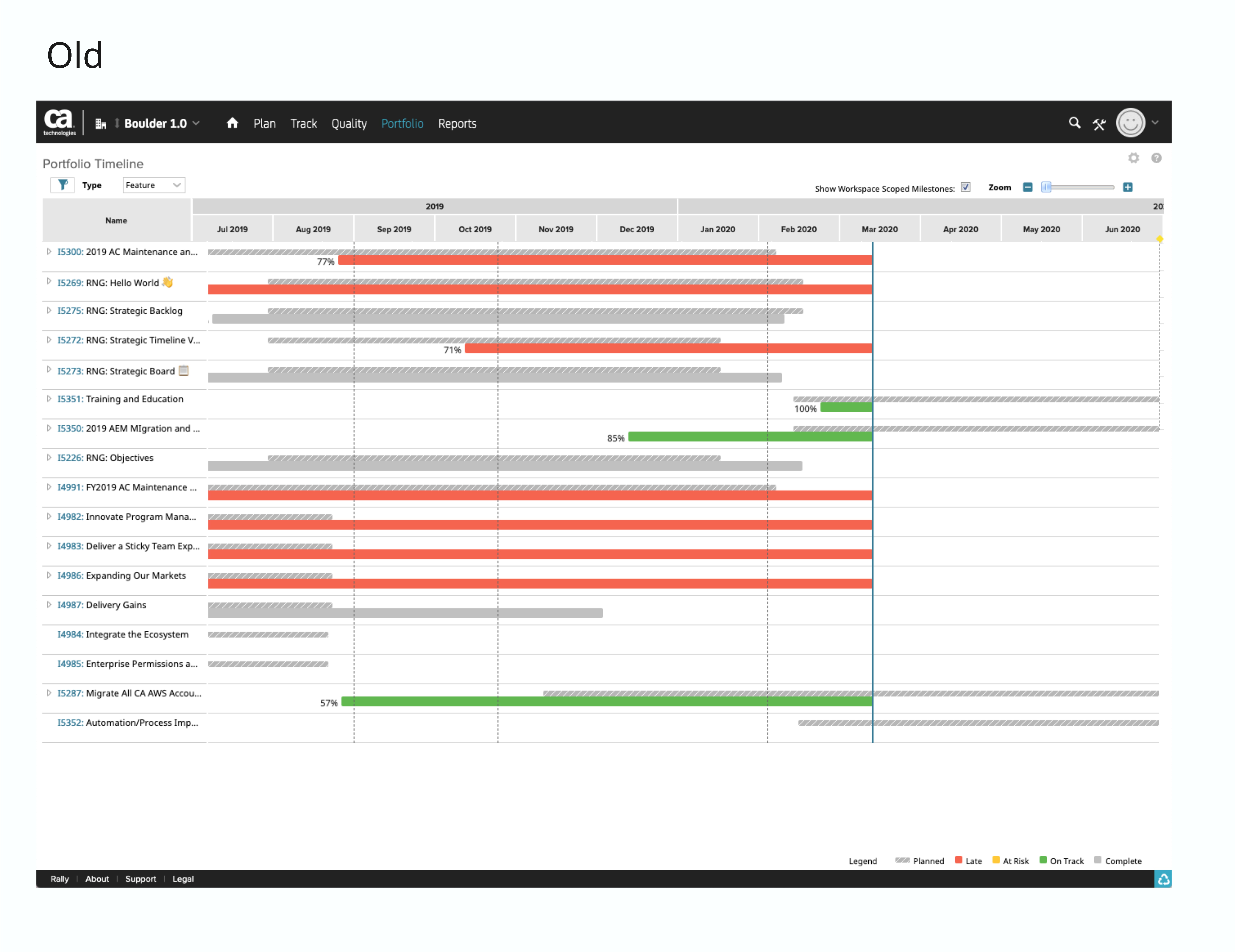
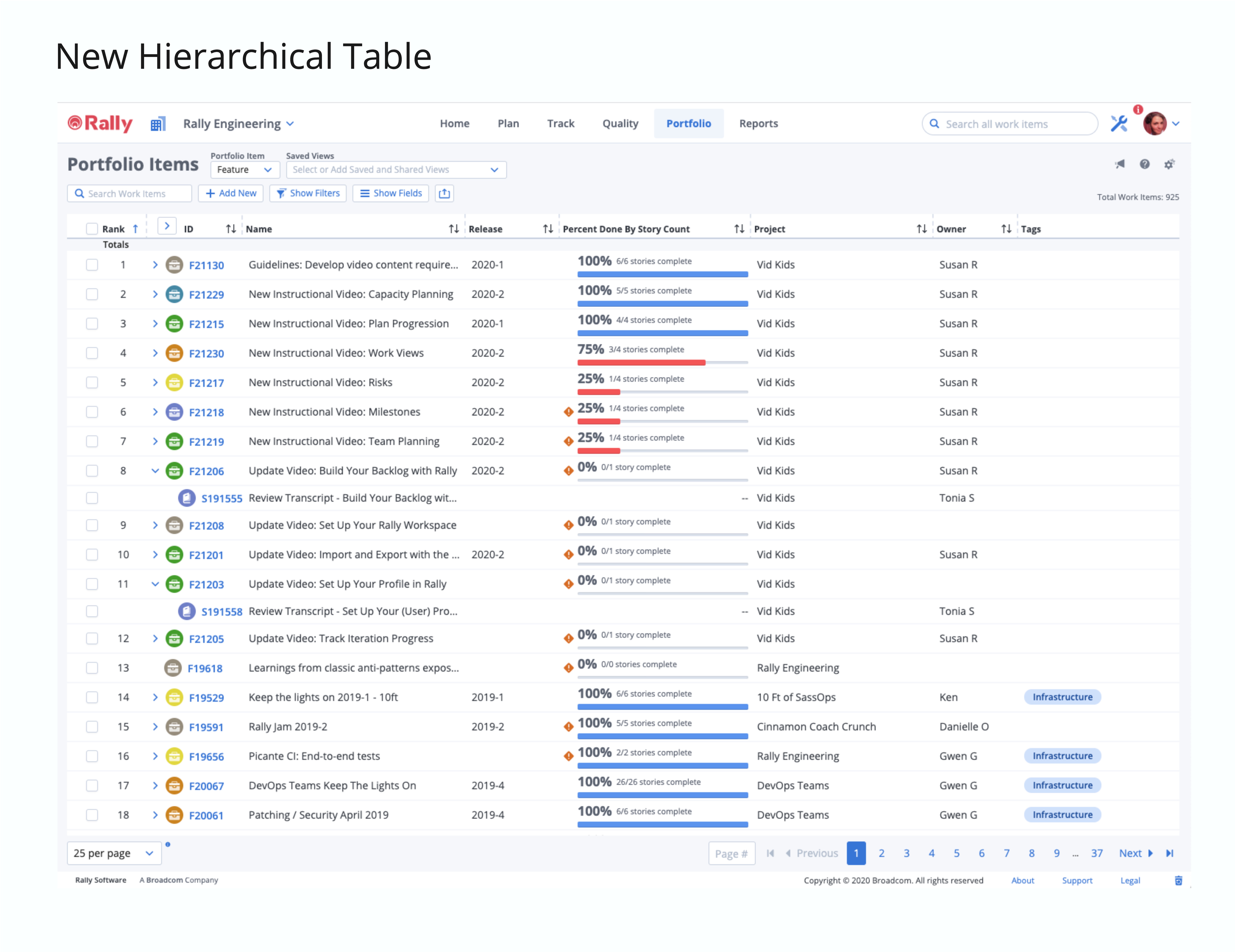
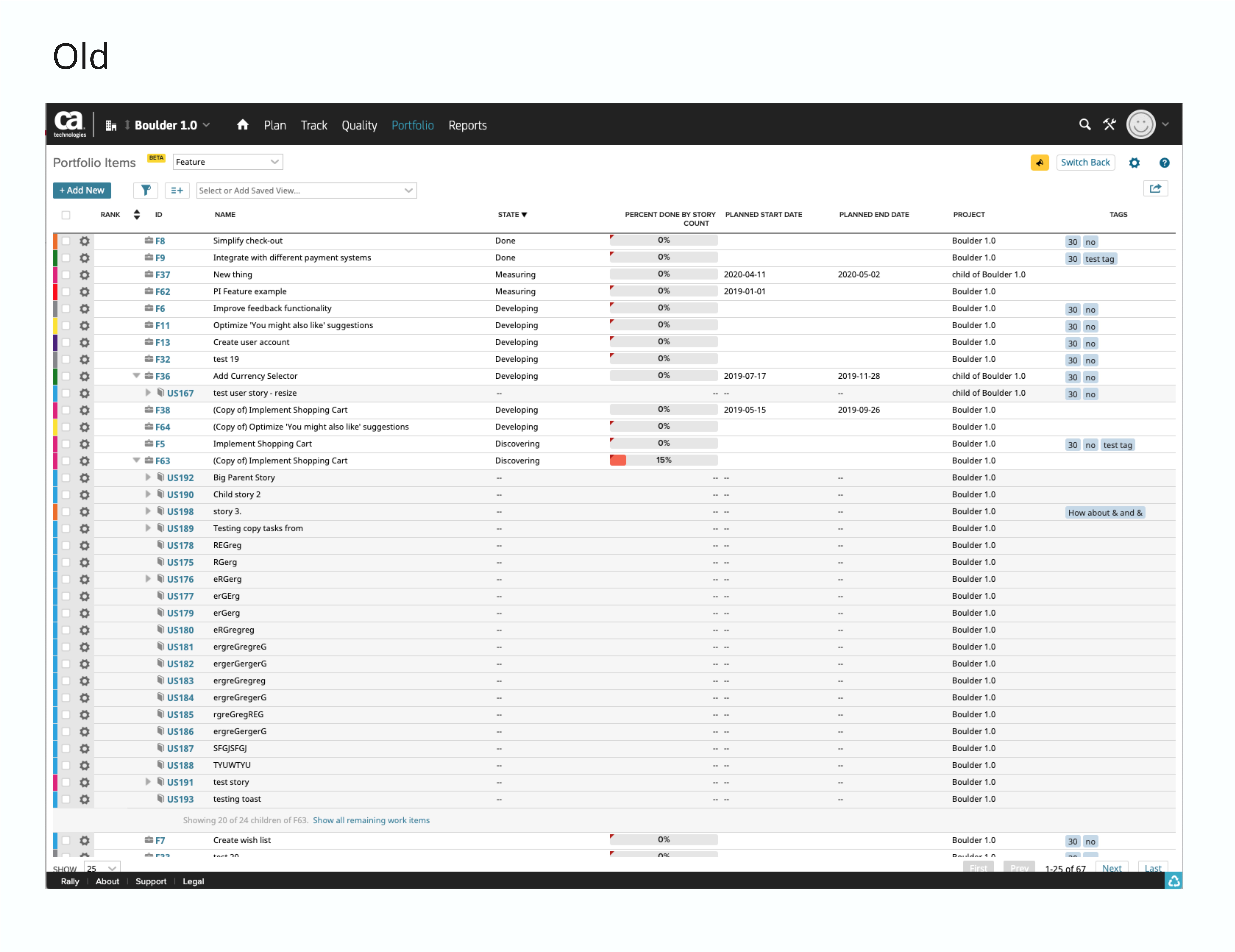
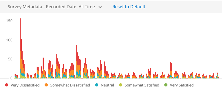
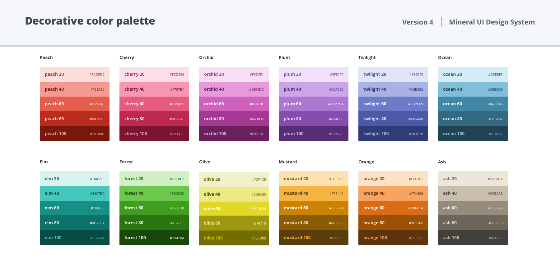
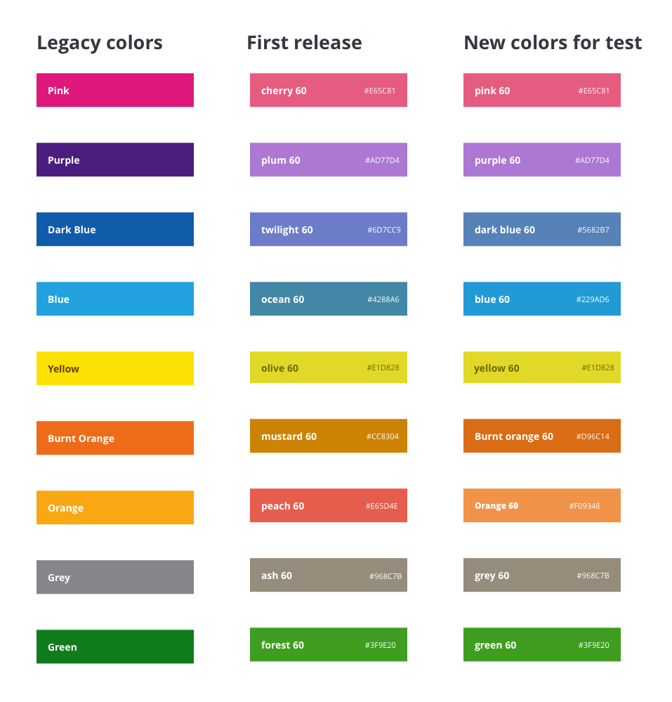
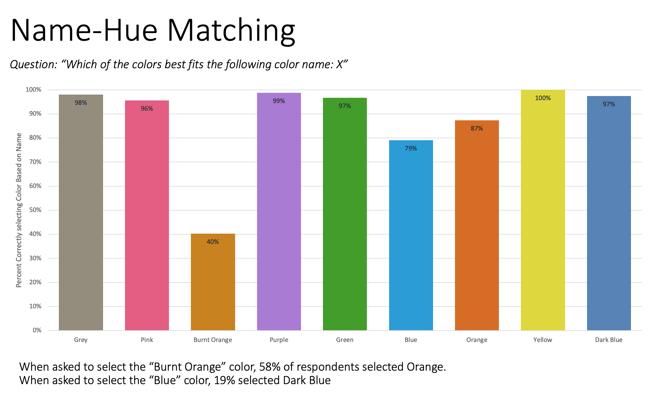
During this effort I laid out several design strategies on how to unify the existing UI and simplify our page footprint that would lead to the successful launch of the new face of Rally.

Challenges

  • The acquisition was very disruptive; it was imperative to stay flexible to change and ambiguity
  • I became the sole designer for Rally. After the acquisition, the UX team was reduced to myself and 1 researcher
  • 2 contract designers were hired, I took on the role of managing their work, leading design reviews, creating UX team plans, coordinating with the rest of the org in addition to my design responsibilities
  • Keeping production fast and accurate in order to stay ahead of 2 engineering teams to deliver a fast turn-around release (7 months) in order to reinvigorate customer confidence in our brand and our ability to release
  • Working with PM to prepare for a customer feedback loop and triage strategy post release

Results

  • First major customer-facing release in 5 years, currently deployed to 100% of our users
  • Releases major a11y improvements
  • NPS increased 8pts from the previous year
  • Visual appeal was the most improved driver on NPS score and increased by 0.3 pts YoY
  • After the release, we grew organically in Q1 11%, which was the first time for growth in 10 years 
  • Converted the majority our pages to React (allows for faster future development and less maintenance)
  • Greatly improved performance: Apdex went from 0.5 to 0.9 and (top score is 1) and Client Side Response Time (CSRT) from 2 seconds to half a second.
  • Increased consistency across experience

Preparing for Launch

It was hard to let go of the new product strategy I worked so long and hard on, but I had to adapt to the influx of changes and I chose to see the chaos as an interesting design challenge. When the org decided to embark on a UI overhaul, I looked at the product of the work I did for a year and a half as a goal the app could one day reach; that work serves as a guiding star.

I started by working with PM to identify a core set of pages that are either central functionality or have high customer usage to convert to a new UI, I also identified how we could consolidate and simplify our app footprint.

I took advantage of a very mature design system that was created by a central design team; this allowed me to work quickly and stayed ahead of the engineering teams to prevent being a bottle neck.

More than just UI

The new UI also came with a tech overhaul. The engineers converted all of our core pages to React (we had many disparate .js technologies) and revamped our existing component library to look like the new design language. The company also invested a huge effort into doing an a11y overhaul, a11y considerations are part of the acceptance criteria of anything we ship going forward.

The efficiency of converting all of our pages to react and using the same components allowed me to include UX enhancements and increase consistency of the experience across pages. For example, in our old application we had several different experiences for a toolbar and we were able to use one to ‘rule them all.’ The new toolbar improved several usability improvements.

Toolbar Consistency

In an effort to improve the toolbar experience, I dedicated a significant effort to redesign it. I created new designs, created a prototype and it was user tested with really positive results. However, this work got deprioritized and we launched with the existing toolbar (at least it was consistent).

Beta Launch

Rally has a very close relationship with its customers. We are in constant communication and are continuously finding ways to engage them for feedback loops and ways to partner with them. PM and Marketing identified a small group of customers to do a beta launch of the new UI, we called this the Trailblazer program. This group was instrumental in testing the new UI and submitting feedback before we did our GA release. We received really positive feedback from the Trailblazer group with 72% positive reactions, 24% neutral, and 2% felt negatively about it.

This gave us significant moving-forward confidence.

Qualtrics Sentiment survey

Sense and Respond

After letting our Trailblazers use the beta experience for a several months, we decided it was time to go GA. We released the new experience to 36K users in December 2019 with very few issues. We set up Qualtrics to collect, triage and categorize the feedback. We received positive and negative feedback. We expected the negative to be the loudest. Over time negative feedback has gone down significantly as we rapid-respond to address bugs, issues, release feature requests; and as users get used to the shock of change. We slowly onboarded more customers to the new experience, some of them resisted being switched over. As improvements were made, customers gained confidence in our ability to release quality updates and in the past 6 months we’ve migrated 100% of our users to the new UI.

Customer Feedback

Negative feedback went down as we addressed defects and requests over time.
``The new rally UI makes it very difficult to distinguish which color a story is assigned, as a product team we use the color a lot to distringuish work items and this update has drastically decreased the readability of the colors`` -User at Ford Motor Company
``Dark mode/dark theme would be great!`` -User at General Electric
“This new Rally UI is terrible. ... Each row in the table takes up more space due to much more white space above and below the text. We need something more compact - especially on a laptop.`` -User at Intel

This is the first time in my career as a designer that I was truly able to iterate on a project post release. Most of the time I only get to iterate based on a user test. The typical story is a company releases something and say they will come back to it, but move onto the next thing. After our initial launch our top themes in feedback (in addition to some functionality parity issues) were complaints about data density, a request for a dark mode and color naming/hue issues. I was so happy to be able to respond and react to negative feedback and fix things for the better.

Color issues (mistakes were made)

Our users are able to assign a discrete selection of colors to artifacts in our app. Previous designers had selected those names and it was what users were accustomed to (Pink, Purple, Green, Blue, Dark Blue, Orange, Burnt Orange, Yellow, and Grey).

The new design system defined a new decorative color palette with “fun” names, I leveraged this work and used the colors and new names in the redesign thinking it would be a re-brand. This was a HUGE mistake.  Users complained they had to update their mental model to map new colors and new names. Not only was this inconvenient, but it messed up their data mapping and queries. Bad designer!

Testing colors

The first thing we did was change the names back to the original nomenclature, that was easy. Customers also complained that the values were too similar and hard to distinguish.  I didn’t want to repeat my mistake so I enlisted our User Researcher to do some color testing. Together we designed a very quick study, we launched a series of surveys in a matter of 2 days and got quantitative data to improve the issue.

I selected a new set of colors to match legacy color names, with an eye toward maximum differentiation between similar hues. 

The study:

  • Test the color names matched with users’ mental models of the presented colors
  • Test the colors were perceptually distinct enough to prevent confusion
  • Participants asked to match color names with correct hues
  • Participants asked to rate the perceptual similarity of proposed colors
  • Survey active for approximately 3 hours
  • Total number of respondents: 279

Survey Results

My new color palette performed MUCH better than the one we launched, but there were still some issues, time to iterate more:

  • While the Dark Blue hue was mis-labeled as “Blue” 19% of the time, when users were asked to identify the “Dark Blue” hue, they were able to do so correctly 97% of the time, showing that the modifier “Dark” is sufficient to distinguish between the two colors when both names and colors are available for matching
  • Ratings of perceptual similarity show that the Burnt Orange-Orange pairing was also rated as most similar by participants, indicating highest potential for confusion and miscategorization

Follow-up test:

Because the Orange-Burnt Orange distinction caused the most confusion in the original test, I developed new sets of yellow/orange/burnt orange hues

The goal of the follow up study was to identify the set that 

  • Produced the fewest errors in hue-name matching
  • Showed the maximum perceptual differentiation
  • That the new hues would perform better than the benchmark legacy colors

We tested 3 variants of combinations of yellow/orange/burnt orange and were able to choose the most performant one.

Data Density

After the GA launch data density became the biggest theme. The new UI has much larger elements, padding and white space. Some of our users loved this, some hated it!

I laid out an iterative approach to mitigate user frustration and improve the experience.

  • The first iteration was to reduce padding of elements like headers, toolbar, space between table rows, that was fairly easy to do.
  • The second solution introduced a user preference to wrap or truncate text in tables. Truncating increased the number of rows on the screen at once, while wrapping allowed the ability to see more information per row.
  • The third solution was to create 3 user setting preferences: a comfortable, roomy and compact view which would apply to all pages, not just tables.
Data Density was one of the top user feedback topics. Some mixed sentiment, but mostly negative.

Dark Mode (WIP)

The next feature request we are currently developing is a user preference for Dark Mode. I am currently working with developers on an implementation strategy and also working with the central design team so that this work can be contributed to the overall pattern library.

Conclusion

I have learned a great deal about the process of releasing a new product: beta launches, collaboration with product marketing, understanding feedback loops, iteration strategies to address errors. Im impressed we were able to release so successfully and onboard 100% of our user base in a relatively short amount of time.

There is still a lot of work to be done (not all of our app got converted to React) but because we were able to get rid of so much old tech, my hope is that we will be able to release new features much quicker now.

I also plan to continue to push my strategy to reduce the footprint of our application and get us somewhere closer to the strategy I had developed before we got acquired.