My friend Paul and 2 of his friends started an online merch business and asked me if I would do their logo. Here is the process I went through to design their logo.
Step 1: DEFINE
Because I knew that the client consisted of 3 different people, I wanted to get them on the same page with the vision of their brand and voice. I gave them an exercise to do together, I had them come up with 5-7 brand attributes and boundaries that they felt conveyed their brand and a short blurb about who/what they were. I helped them out a little with some of the adjectives to make sure they were really pin-pointing to something uniquely theirs.
Mister Merch is a full-service merchandising company dealing with all-things merchandise. We fulfill design, printing, and logistics needs for anyone – bands, brands, and companies. With collective experience on both the client and business sides, we know how to make your life easier. Our aim is to achieve global merch domination while keeping it weird in Austin, TX.
ATTRIBUTES AND BOUNDARIES:
Artistic, but not exclusive/snobby
Professional, but not corporate
Modern, but not sterile
Helpful, but not salesy
Clever, but not cheesy
Small and accessible, but not DIY BS
Current, but not cliche
Step 2: VISUALIZE
Having a better sense of who they were as a brand, I started creating a mood board of images that I thought visually represented their persona. I used a Pintrest board to gather my images with descriptions of what I liked about them and how they related to what we were trying to achieve. I had them pick a few favorites and describe what they liked about them. Once I had this visual language to tie to their written description of themselves, I started to sketch.
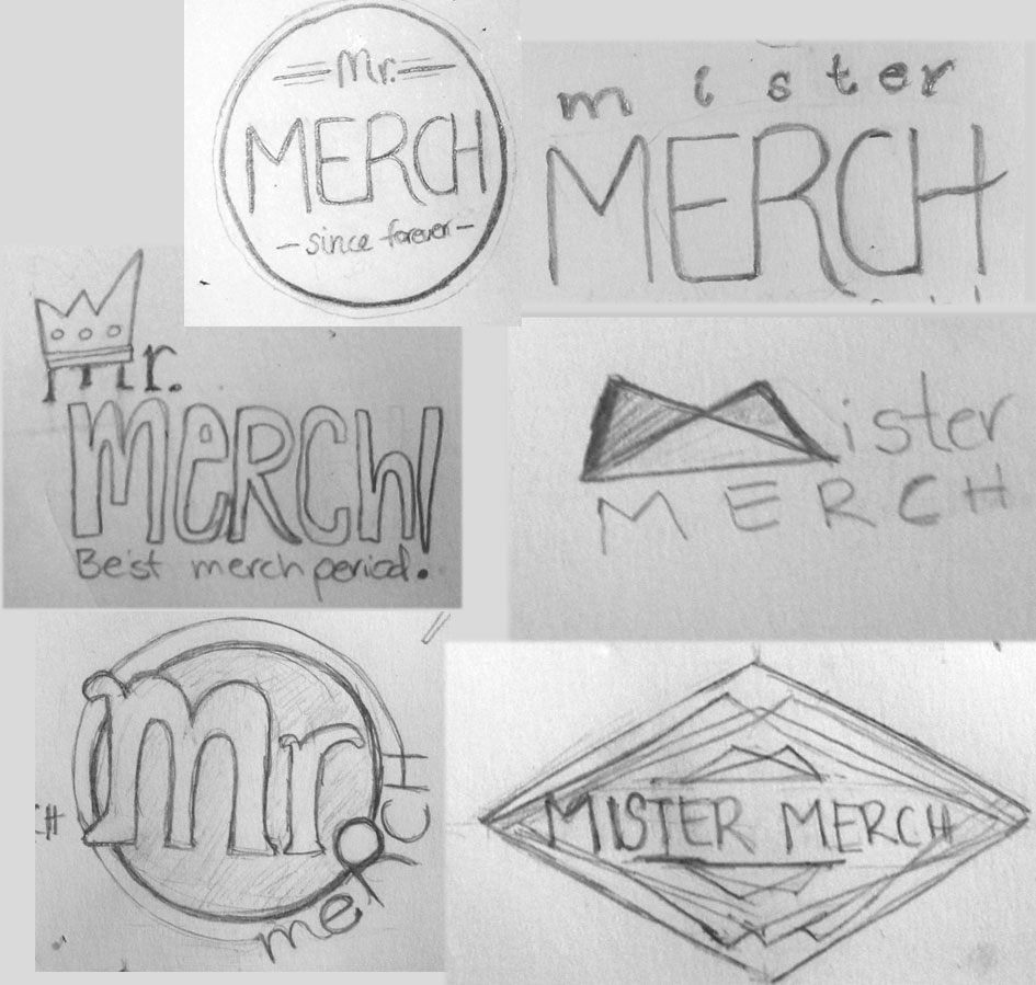
Step 3: PAPER SKETCH
I had a call/go-to meeting with them to go over each of the sketch ideas, reminding them that these were really rough ideas and were really more of a way to keep narrowing in. I asked them to pick 3 ideas they would like me to explore digitally.
Step 4: ELECTRONIC SKETCHING
I then started my electronic sketches, this is where options go crazy. I can come up with a million different configurations by mixing and matching shapes, fonts, etc. I paired it down to my favorites and put together an artboard to share with the guys. This time, I requested that we do an in-person meeting. I wanted them together at the same time, to go over the options and explain them thoroughly, I also wanted to see their reactions and group dynamics in real time. They all gravitated to one design in particular and were confident in picking that one. This made it really easy to move on to the next step.
Step 5: REFINING
Now that I had one clear direction I could focus on, I explored a few different solutions within that design. I tried slightly different fonts, line weights, etc.
Step 6: FINAL CLEAN-UP
Once they picked their favorite, I was able to dedicate some time to making sure the file was just perfect, all the lines were just the way I wanted and aligned. And that’s how I made a logo.


