Exercise:
Design a solution that makes daily grocery shopping more fun, more meaningful, more efficient, or all of these.
The following is a transcription of a document that I assembled to narrate the process of the concept for a project I call Hey Dinner. Full pdf report here.
I personally hate grocery shopping, I find it a giant waste of time and find little joy in it. I would most definitely pay for someone else to deal with the hassle. I initially made the assumption that everyone was like me.
Based on this assumption, I thought I should build an interface that allowed users to shop and pay for groceries from the comfort of their PJ’s. Groceries would be delivered or simply picked up from the store. I thought it might be cool to include a mobile app that was a list builder that synced to your account and would be there ready for shopping time.
As I designer, I know that not everyone is like me. I needed to know how people shop, what motivates them, what they like and hate. I needed to validate that this was a concept people would pay for. I thought for sure people would pay a decent amount to avoid the hassle and the time-suck that is grocery shopping.
Spoiler: I was wrong.
MY PROCESS
- Brainstorming: I came up with as many ideas as possible and tried to play them out from start to finish in my head to see if they went anywhere logical
- Define audience: Who was I creating this for. Helped define some constraints and boundaries for the “idea farm”
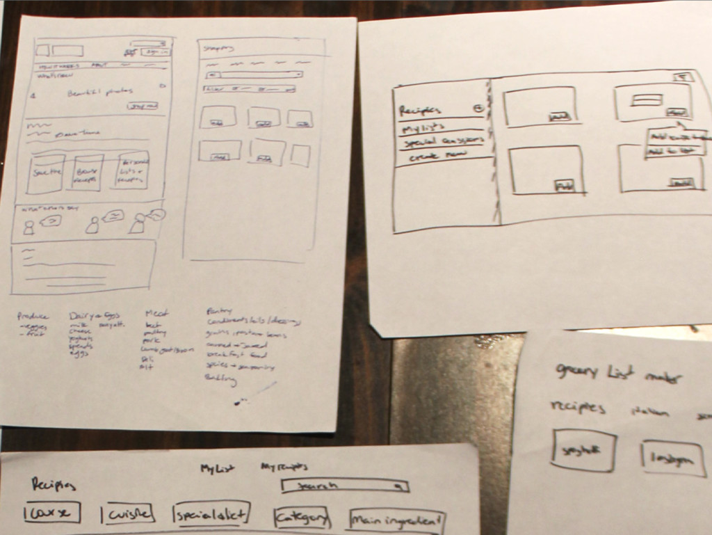
- Quickly sketch a few of the ideas to help visualize how they would work and if they would make sense
- Write script for interviews to validate main idea
- Analyze results and highlight repeating themes, unexpected results, validation of assumptions
- Redefine concept and refine audience
- Identify key opportunities to eliminate pain points, elevate joy points and find ways to make the user feel awesome
- Translate those opportunities into basic requirements
- Make lots of lists and define information architecture
- Start sketching on paper
- Refine wireframe in Omnigraffle
- Request peer review to get feedback
- Make outline and write narrative
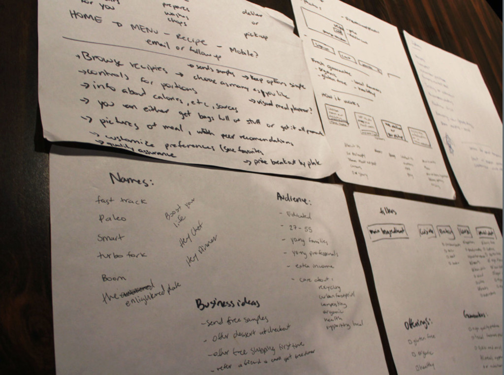
Audience
Basic demographics:
- Ages ranging 25-55
- Higher education, curious and motivated to learn about things they care about (social justice, politics, food safety, health, nutrition)
- Health-conscious, they work out several times a week (pilates, yoga, cross-fit, community gyms)
- Young professionals, satisfied in their careers
- Young families who value free time, would rather pay people to do the menial stuff so they can enjoy the sweet stuff
- They have extra income (meaning the basic things are covered, they are not living paycheck to paycheck)
- They care about their surroundings and the world around them: recycling, carbon footprint, composting, organic food, supporting local businesses
This part of my research was one of the most valuable points in my process for this exercise (if not the most).
Highlights from the interviews:
- People like shopping at upscale stores because they know they can find quality items they care about, even if it costs a bit more.
- They would like to buy at smaller, boutique stores or farmers market, but don’t have enough time.
- Everyone is a frequent flyer, they go once or twice a week (don’t want things going bad), sometimes they go more often than that. (“opportunist shoppers”).
- To my surprise, they don’t make lists or plan ahead. They simply buy the same things every time.
- Buying the same items in a precise order prevents them from forgetting things.
- They wished they were more creative.
- Didn’t forget things very often. If they were already home, they didn’t think it was worth the trouble to go back to the store, would rather make do without the thing.
- Don’t plan in advance unless theres a special occasion (time constraint).
- Everyone was concerned about produce quality, weren’t sure if they trusted others to pick out produce with same standards they had (even though they all had the same standards).
- Most everyone wanted organic or at least were conscious of origins of food. Were willing to pay extra for organic as long as the perceived cost wasn’t THAT much more than the conventional option.
- Checked labels for ingredients and nutritional information.
- People like to browse for new things or displays, they would take the time to walk around. Enjoyed the free samples
- Like aesthetics of the displays, especially produce.
- They mentioned being swayed to make purchases they did not intend on making (non-essentials)
- Alcohol was on everyone’s purchases.
- Couples go to the store and buy separately, but communicate with each other.
- They considered healthy options when shopping.
- 2 people liked the social aspect of short interactions with strangers.
- Parking lots were a huge hassle. 2 people mentioned this to be a huge stressor in the experience. Even avoiding the task all together if parking was going to be an issue. Also choosing the store based on parking lot knowledge.
- Most everyone found the chore to be tedious and time-consuming.
- However, they wouldn’t pay very much for someone else to do the time consuming portion of shopping.
- Quote from interview ”If I’m buying online, I don’t want to feel like a robot clicking away.”
- Didn’t want to pay an “unreasonable” amount for online services.
- Didn’t want to feel like they being extravagant or impractical.
- Quote: “I would pay a premium if someone prepped the food for me and I just had to cook it”
- Wanted services to be upfront about process, cost, delivery, etc. (setting expectations)
I realized my concept service needed to be more than just replacing the chore or the store. It had to amplify the experience. It had to offer something the store wasn’t going to do for them.
Opportunities
- Because they are buying the same things and probably cooking they same meals over and over again, offer creativity as a service.
- Deliver and promise quality, healthy food.
- Make the business philosophy align with what’s important to them.
- People wished they had the time to go to boutique stores or farmers market, offer an easy way to make those things accessible.
- Planning meals takes time: offer to do that for them.
- Delivery option not only saves time, it eliminates the has- sle of parking at the store.
A solid concept was baked
Hey Dinner
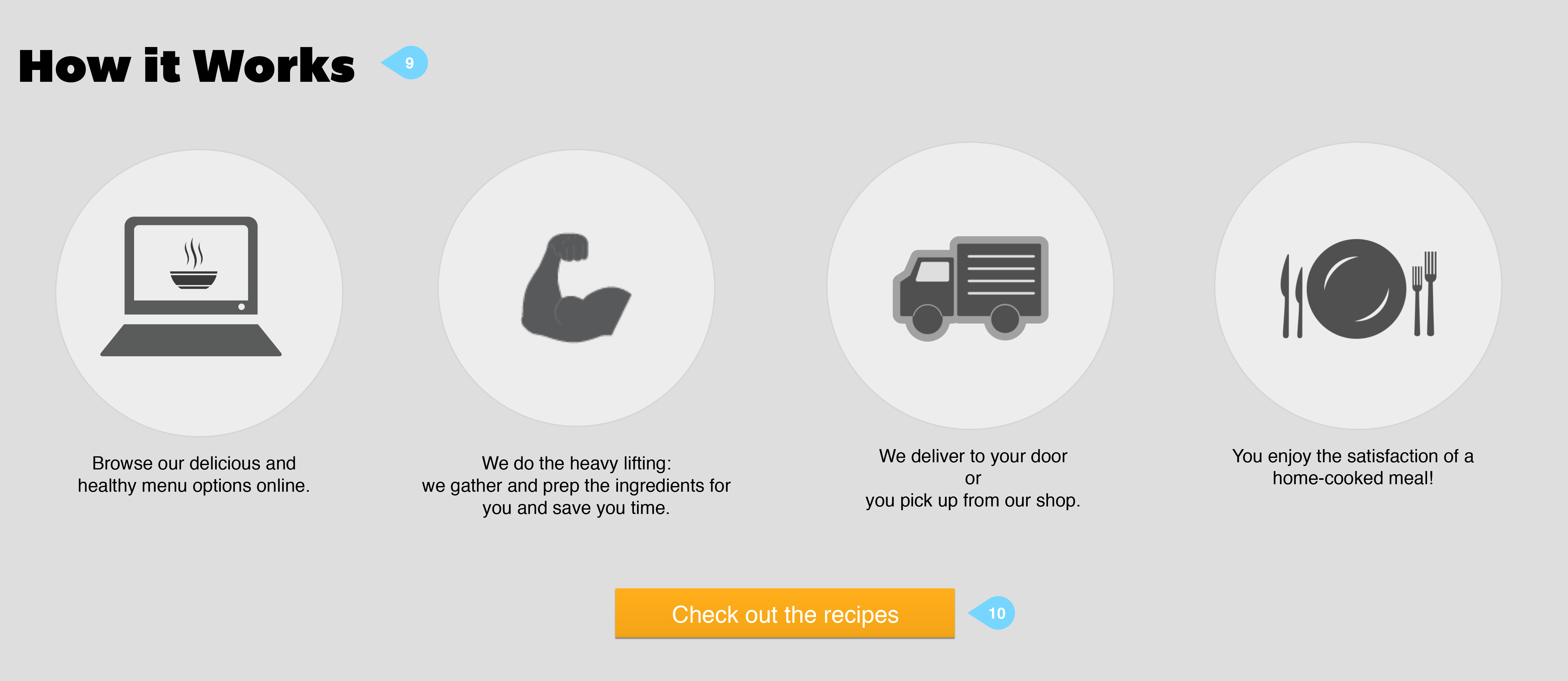
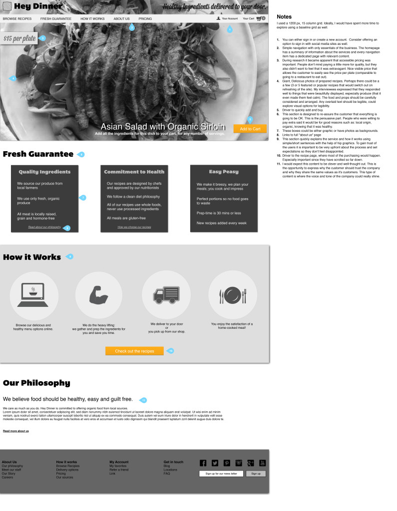
A service that offers a variety of healthy, whole food recipes that are approved by nutritionists. All ingredients are promised to be high quality, organic, non-processed and gluten-free. The user chooses the meals they want and how many servings they will need. The services gathers high quality ingredients from local sources and por- tions them perfectly for the customer, eliminating math and waste. The customer can have the ingredients delivered or they can pick them up. The customer enjoys a creative and home-cooked meal without the hassle.
Requirements and other considerations
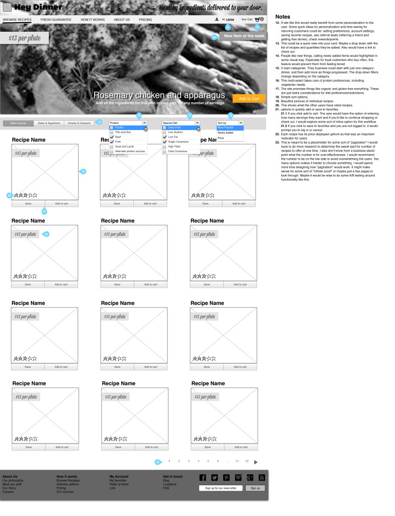
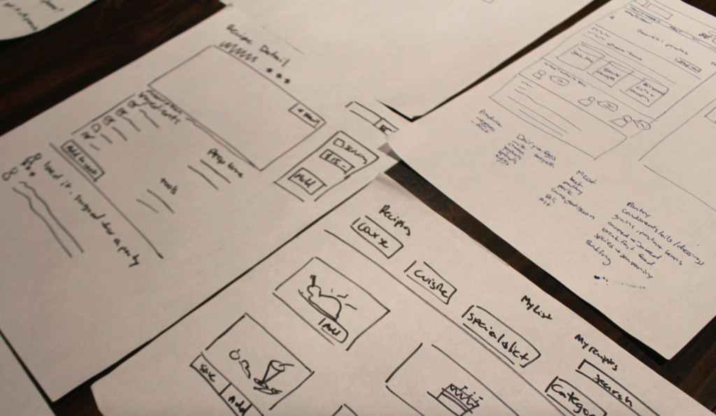
- User must be able to browse a variety recipes with simple filtering for dietary preferences and restrictions
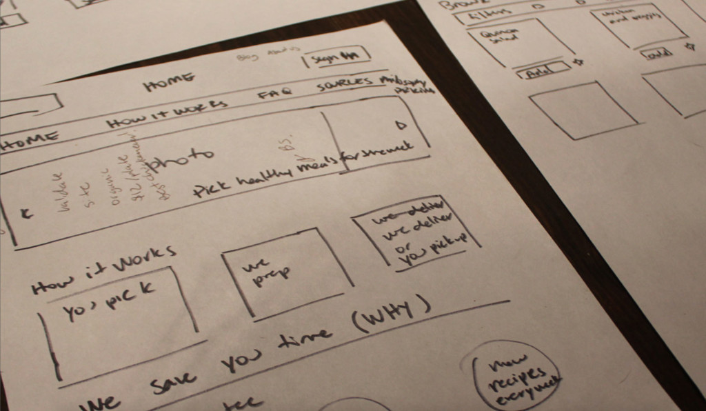
- Make process simple, upfront about the mechanics, how it will work and any delivery information.
- Keep options simple (keep cognitive load low—too many options makes it harder to choose). Would probably
- have to do some research on how many recipes to show at a time that would make sense from a business
- stand point and where there’s a breakpoint with users motivation to scroll through options)
- Showcase new items.
- Focus on the main meal that would be cooked at home: dinner
- User can input how many portions they want.
- User can un-check individual ingredients they might already have at home
- Display info about nutrition and sources
- Offer delivery of ingredients. (maybe a third tier of the service would prepare meals)
- User should be able set preferences and save favorites (personalization)
- BIG pictures of meal (visuals are of utmost importance)
- Show peer recommendations and comments (replaces social interactions with strangers at the store)
- Quality assurance and guarantee. Always deliver on the promise, creates trust and reputation
- Display pricing in a way that easily allows them to compare cost to convenience
- Price breakout by plate
- Other things
Voice & Tone
This is a smart, hip population. They should never be talked down to, the copy should appeal to their intelligence. This is a great audience to be clever and witty with. The brand should be personable and unique, not stuffy and corporate. Can be quirky and unique without sounding like a burnt-out hippie. Using the home page as an opportunity to succinctly explain the business and the service, but if the user is interested they can visit the blog or dedicated pages with longer content.
Other business ideas and offerings
- Send free samples of other things customer hasn’t tried (desserts). People love free things and they love samples. Builds brand love.
- Email as followup’s to any order. Can gather feedback, recommendations, or sugges- tions. Tone is important here: cant sound like an annoying spam robot.
- Create loyalty by offering rewards or point system.
- Successfully refer a friend and get each get free dinner.
- Visual meal planner for week/month? .
- Free shipping for first order.
Wireframes and other materials
Comments are closed.