Roadmapping tool (WIP)

Context

As an Agile Lifecycle Management tool, Rally’s power comes from the ability to aggregate data from teams and trains and do roll ups at the program layer to communicate up to the executive levels.

In Scale Agile Framework organizations, the crux of the program layer reflects a need to manage demand (business needs) and supply (teams and other resources) in order to meet larger business objectives, and then communicate those plans so that they are accessible and transparent to the entire organization.

The top pain points our customers face is creating accurate plans for teams to execute. We wanted to create new functionality that would help organizations with this challenge. Plans are the intersection of people, work and time; they constantly change and need to be communicated through all the layers of the organization.

Results

  • During the Agile 2018 Conference of the new product demo, the timeline view garnered the most excitement and praise from our customers.
  • Several of our accounts decided to renew their subscription with us based on the new feature.
  • Offering our customers roadmapping capabilities eliminates the need for extra roadmapping tools and keeps all the data centralized within Rally.
  • The roadmap for future iterations of this feature will take shape as we collect more data and feedback during our beta phase currently in flight.
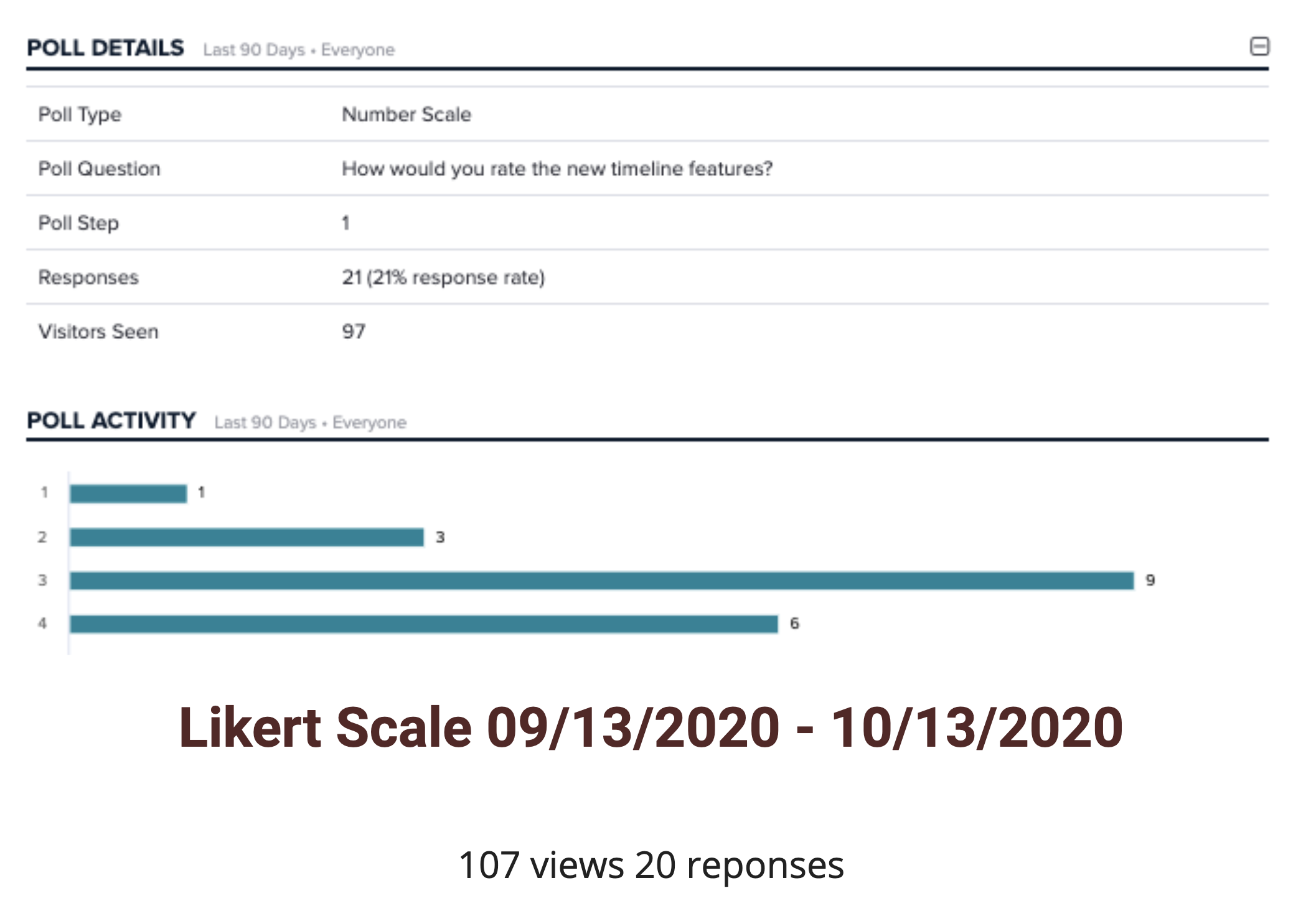
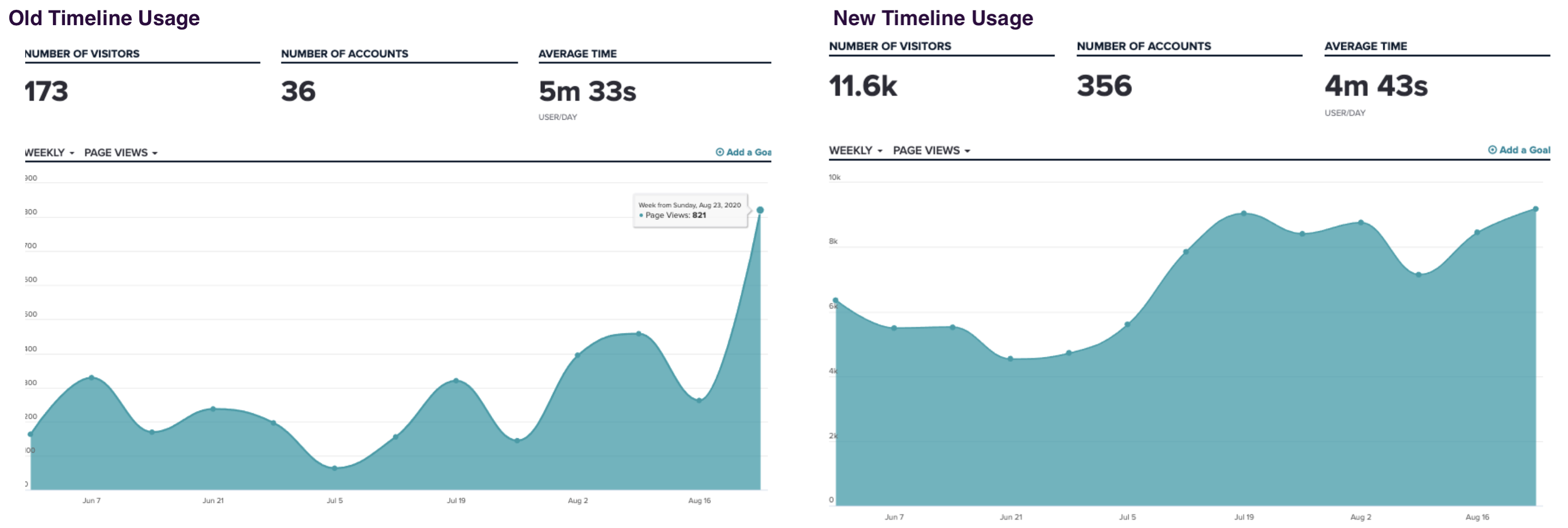
The new timeline gets more usage in an MVP state than the legacy timeline does.

Defining a brand new capability

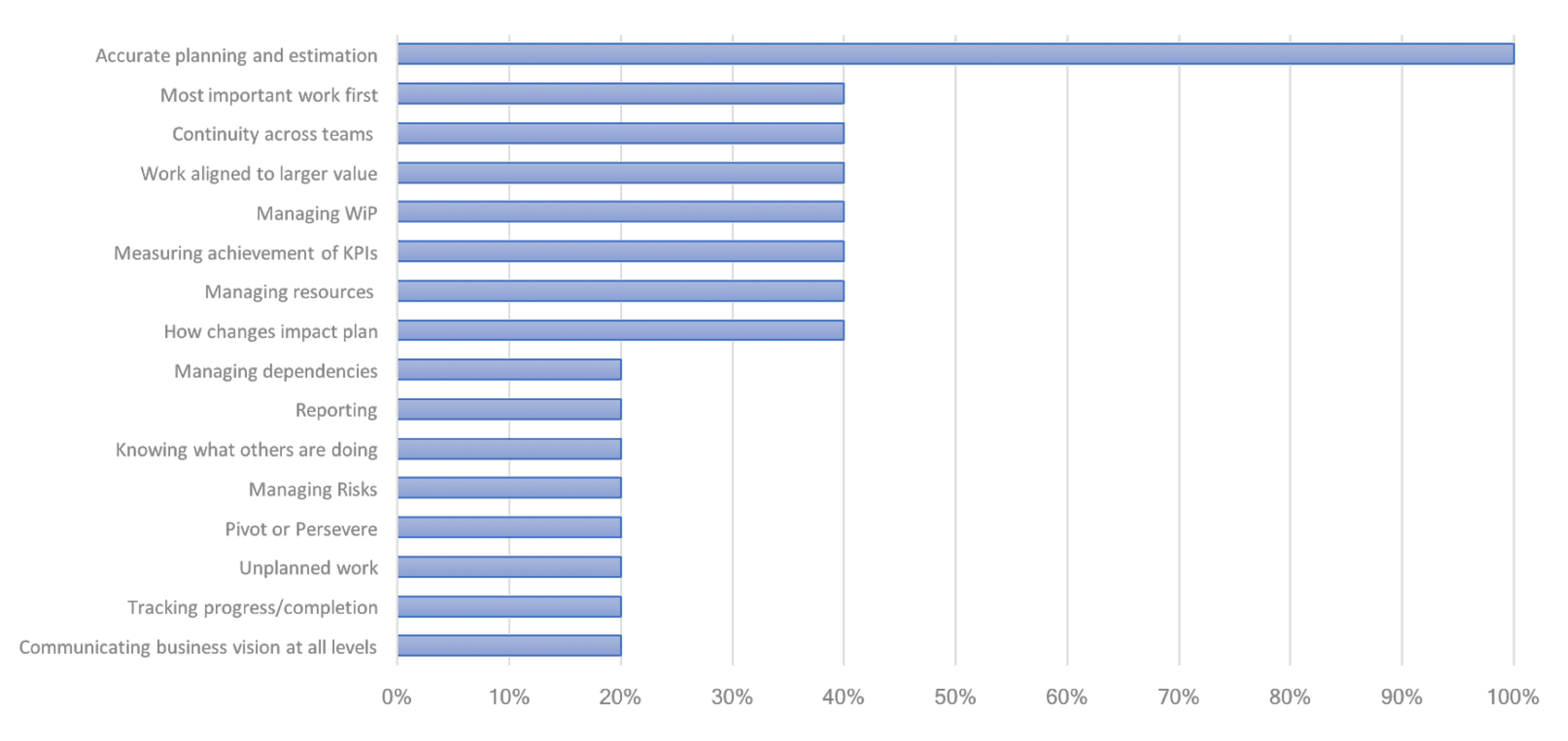
During our product strategy initiative to relaunch Rally, we were able to identify our customer’s top pain points by conducting a survey to gather a deeper understanding of what their top challenges were.

After analyzing and quantifying this data, coupled with Customer Voice feedback, NPS feedback and other data sources, it was abundantly clear that organizations struggle to create accurate plans. We wanted to help customers become better planners. We saw an opportunity to service Program Managers who spend a lot of time communicating plans up and down the layers of their organizations; upward to executive leaders who want to know how things are going and when things will get done, and downward to teams on business needs and taking their input to create plans.

Customer pain points survey

Despite the fact that creating accurate plans was our top customer challenge, the existing implementation of a roadmap tool in our application has very low utilization.

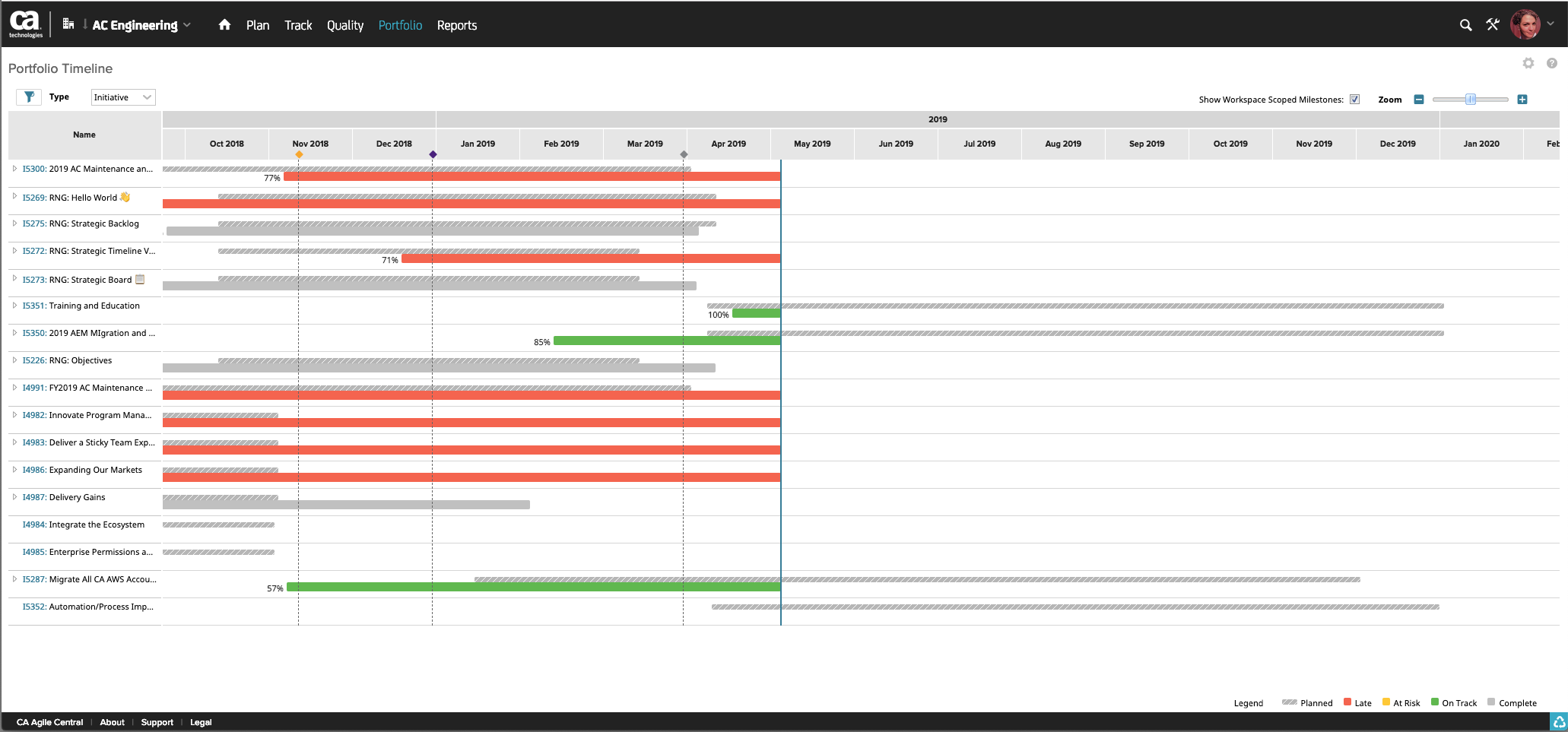
Old timeline in the product

The old timeline is not interactive, it's a static view from a list of work items, the tech is written in ext.js which has poor performance, it's also very inflexible and does not integrate with any other page in the app.

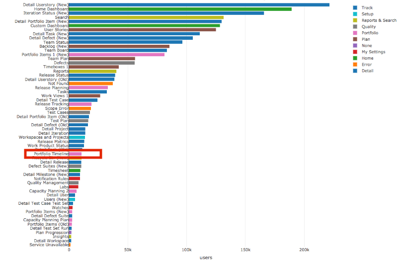
Old timeline page has very low usage

The old timeline ranks #17 in usage order of our core pages as a result of a poor design and implementation

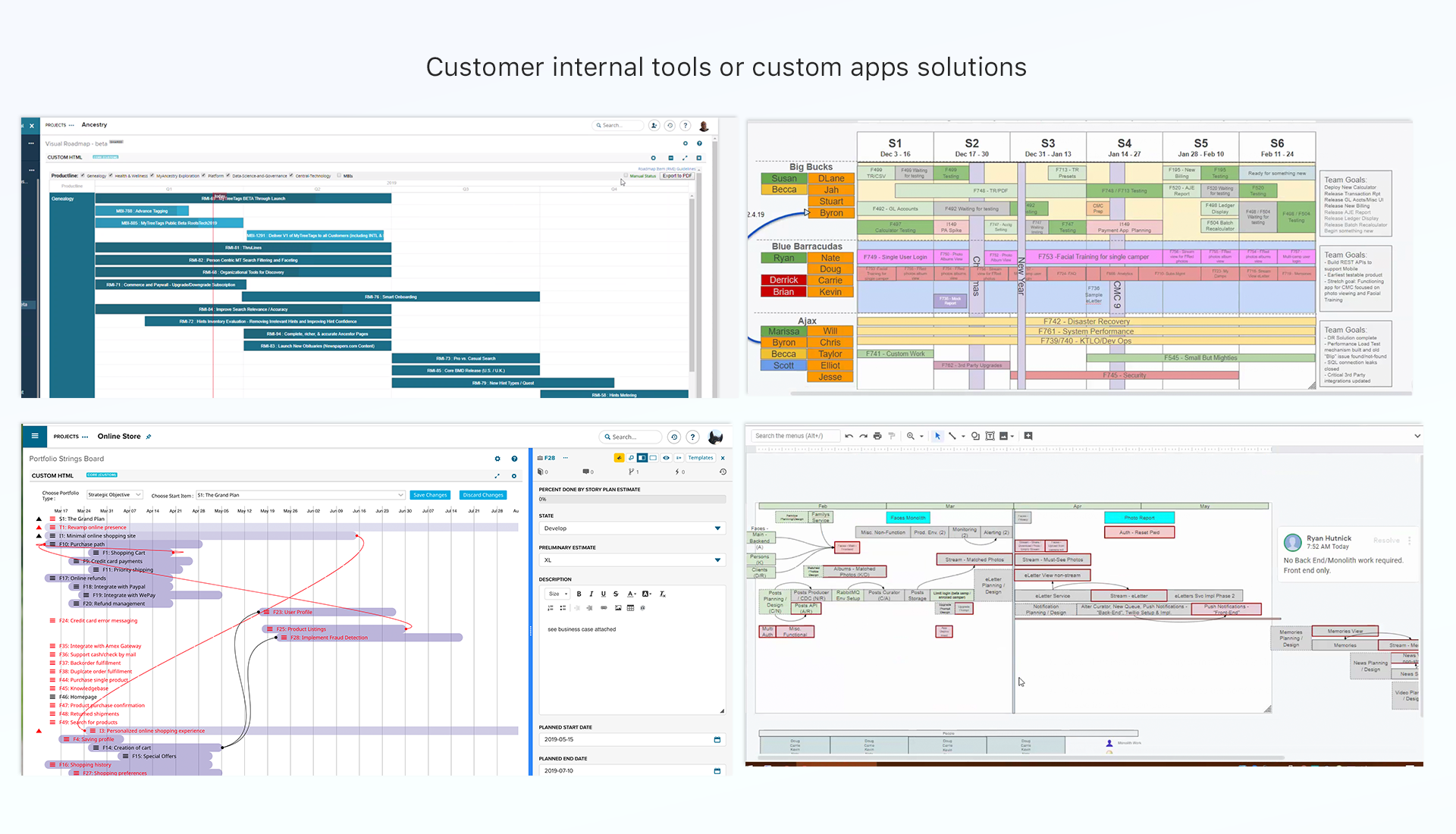
Customers have such a deep need for a roadmapping tool that many of them have created their internal solutions. These customers are very excited to get a native roadmapping tool that integrates with the rest of their workflow in Rally.

My role

I worked with Product Management to create hypotheses statements around the problem space so as not to get initially too attached to any particular approach, and secondly so that we could evaluate solutions and validate with our customers based on initial assumptions.

We formed hypotheses that stated how timelines or roadmap views would help our customers become better planners regardless of their process.

At this time, we were figuring out the larger product strategy and had several high-stake ideas that needed early validation. I worked with leadership and advocated to run 3 concurrent design sprints to explore solutions for the customer top 3 challenges, including better planning.

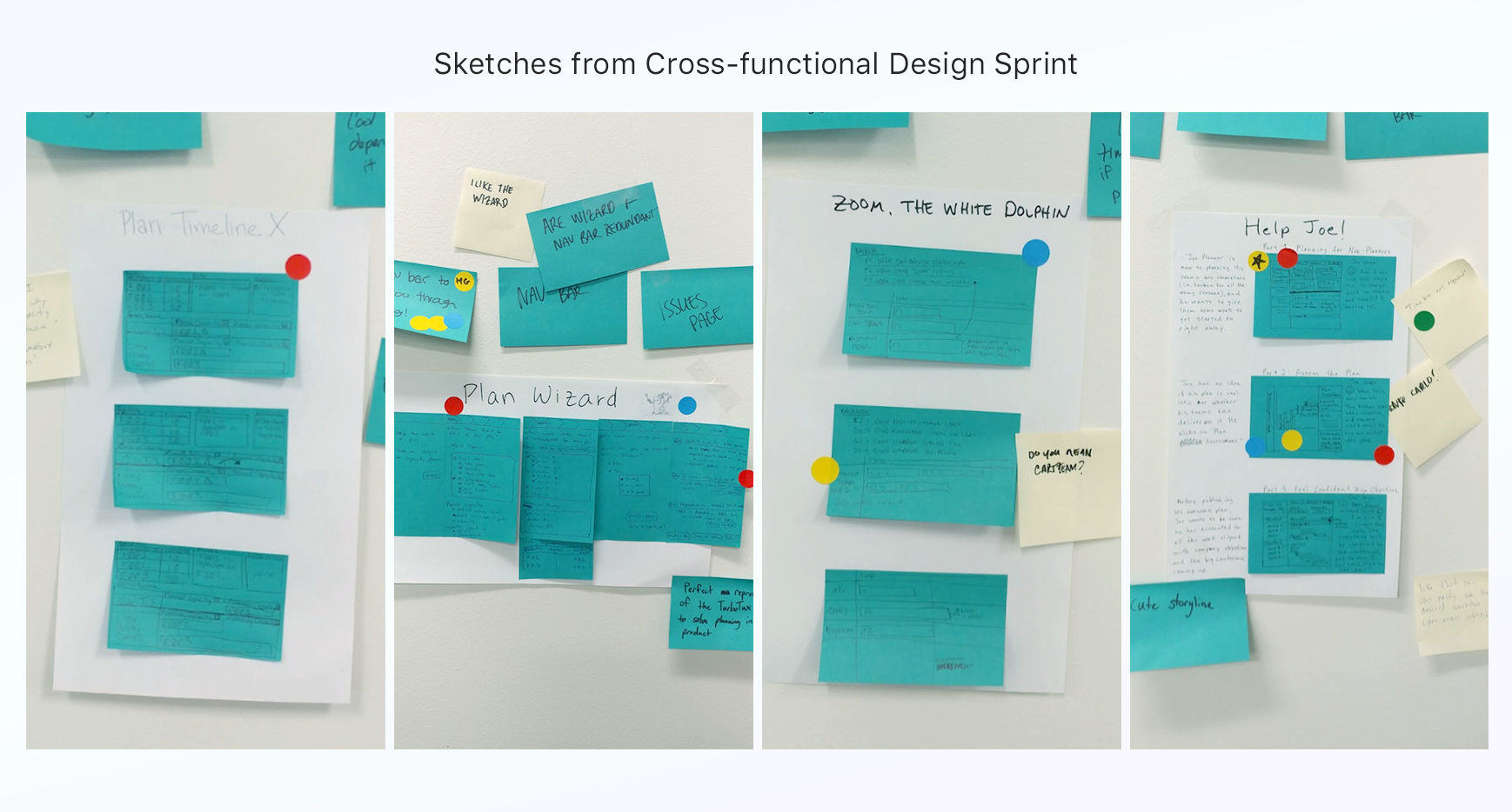
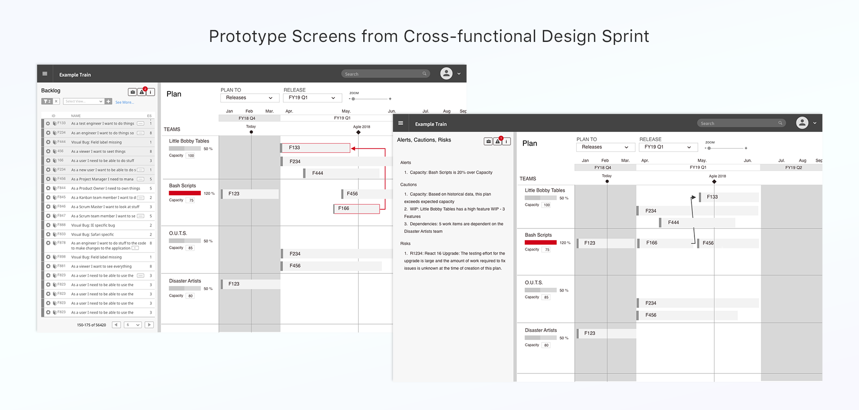
A cross-functional group I was not a part of, created a prototype that included a timeline view to solve for “better planning”. The prototype was well received, the users gave the timeline high marks.
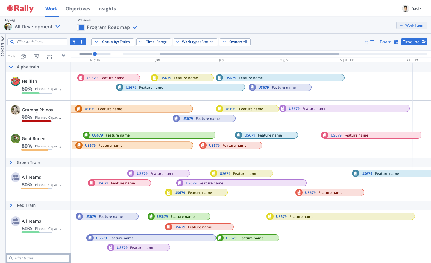
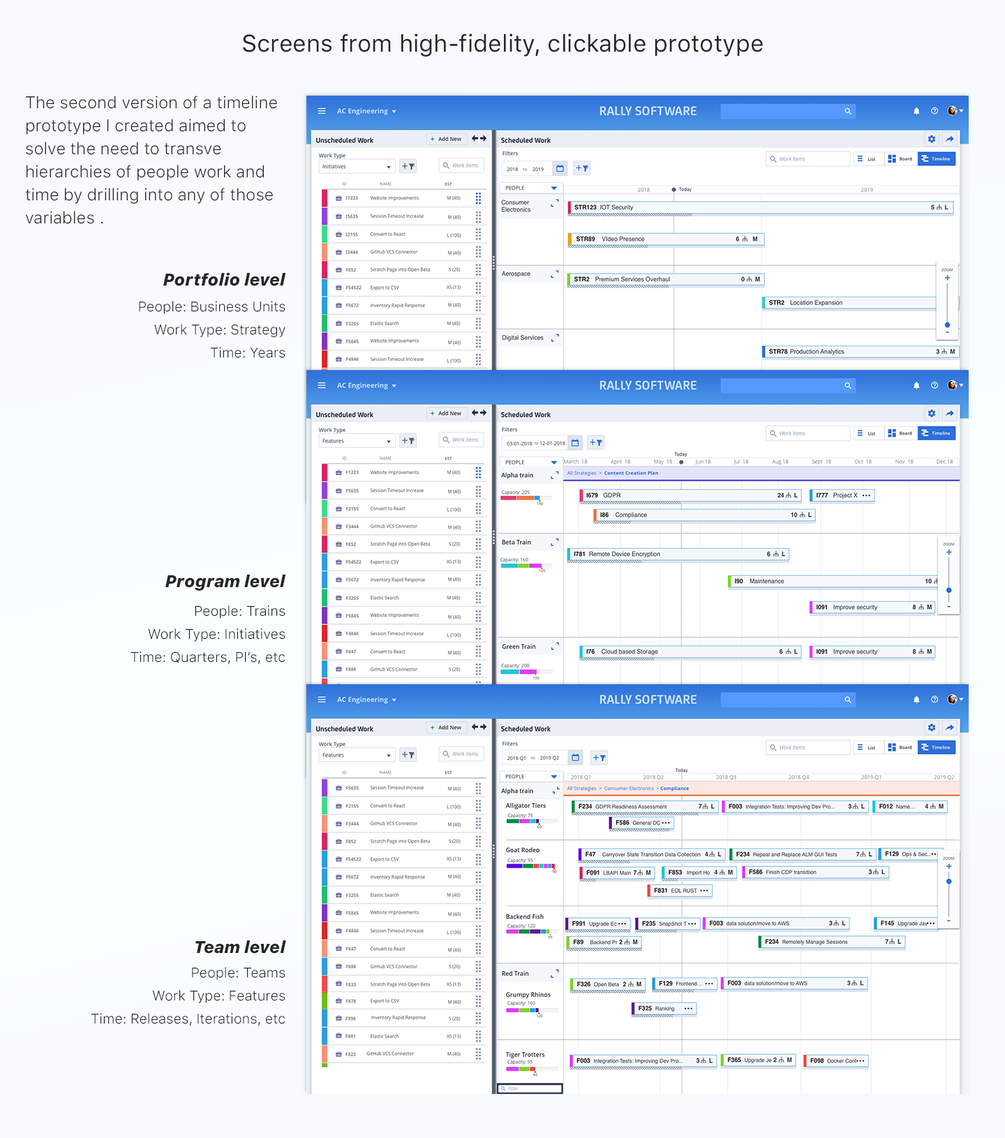
Some time later, when it was time to push the concept forward, I analyzed the findings from the design sprint. Based on the feedback collected from the user tests, I iterated on the designs and created a higher-fidelity, clickable prototype to further test timeline functionality and limitations.

In this case we wanted to see how customers expected to transverse hierarchies of work, people and time. In addition, we wanted to test if a timeline view would be a good way to track the progress of work in flight.

We wanted to get rid of the notion of static plans that only users with the appropriate role and permission would publish and then hope they were realistic enough to get accomplished. We wanted turn plans into living, breathing things that would be changed and adjusted (responding to input) on the go without disrupting the work in-flight and that everyone in the organization would have visibility into.

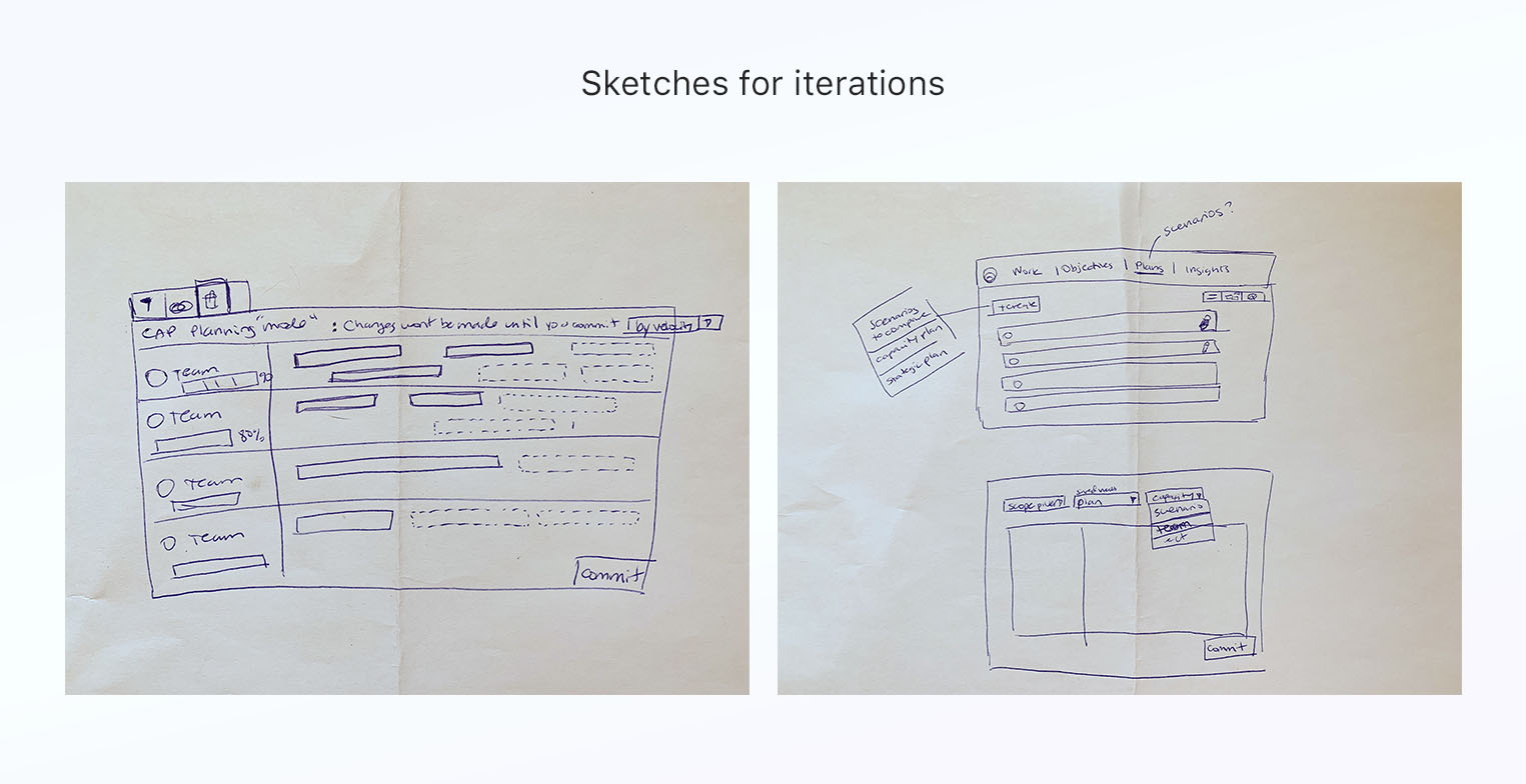
The findings from user tests on the high fidelity prototype and feedback from stakeholders lead to more iteration and refinement on my part.

Once the functionality became solidified and validated, I created all new visual design and patterns for the timeline. It was a completely new component and it was not included in the new design system we were consuming from the centralized design system team. I made sure to check in with them often to make sure my visual design aligned with the overall library.

Extra Screens and interactions

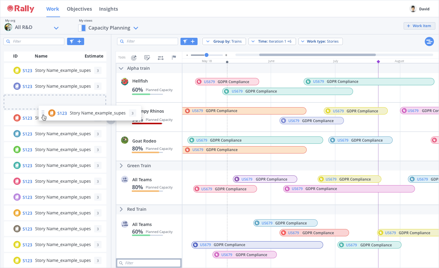
Drag and drop

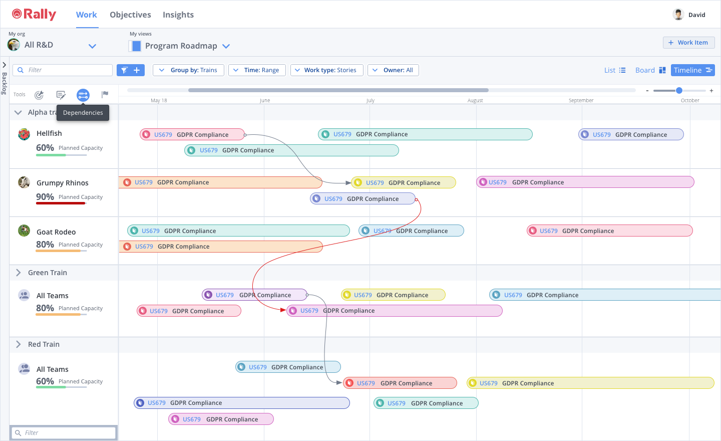
Dependency tool/mode

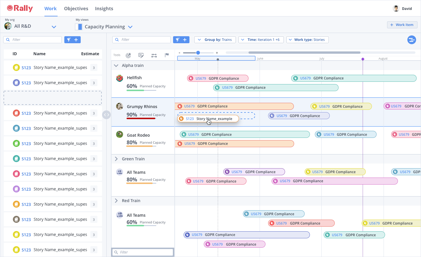
Drop target

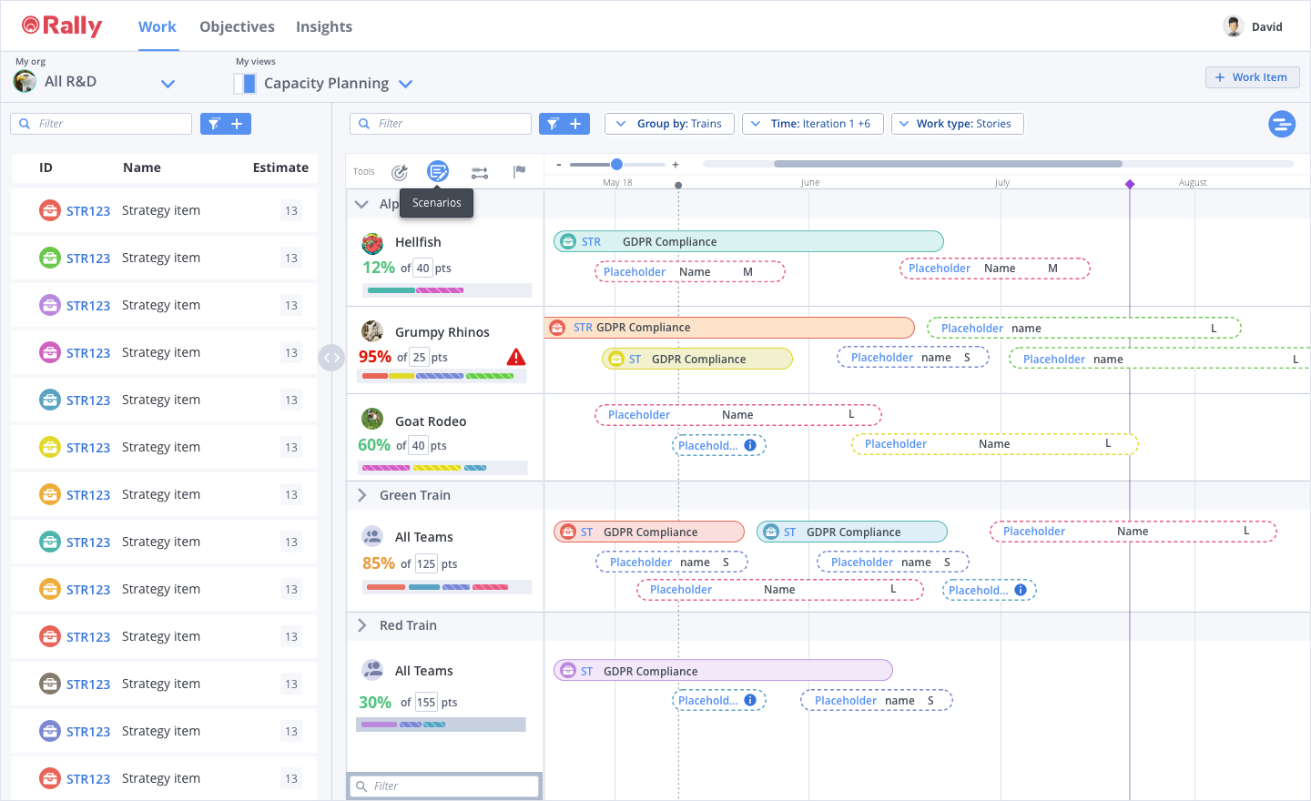
Scenario planning mode

Along the way, I worked and collaborated with engineers to explore the feasibility of this new feature. They consulted me as they chose a timeline library to work from. I provided support during the development of the new react-based timeline component. As part of the refinement process, I designed new interaction patterns for timeline user tasks such as drag and drop, planning modes, zooming, panning, etc.

Customer Quotes

When can we have this??? Is it tomorrow? -John Deere
Timeline view really resonates the most. Projects have natural start/end dates that don’t fit in timeboxes, being able to use it for our monthly planning would be helpful. We need a way to look at allocations for people, plans, work. -Visa
Would love to be able to show executive leadership something pretty like this to communicate on what we’re doing -Cox Automotive
How soon can we get this? -Cisco
Hadn’t looked at the timeline lately, I see you've added functionality – I love the way that looks. It's is a great solution. `{`...`}` Now I REALLY love it! When it will be GA? -Cox Automotive

When is an MVP really viable?

Due to limited engineering capacity, Rally was not going to be able to ship the fully-featured timeline by the internal deadline. PM was eager to ship whatever we could as fast as possibly, my concern was that the functionality was so limited and users would not be able to accomplish their tasks with what they wanted to ship. In my mind, this put the project at risk for failure (another forgotten feature that never got iterated on).

In the interest of moving forward, I negotiated with PM and we agreed that we would launch an initial MVP if they allowed us to conduct a usability study on the legacy timeline so that we could use it as a benchmark to measure future iterations of the new timeline we were building.  Between product, engineering and myself, we were able to define a set of functionality that would be minimal and viable enough to get good customer feedback.

This is the current live code version we launched with beta testers.

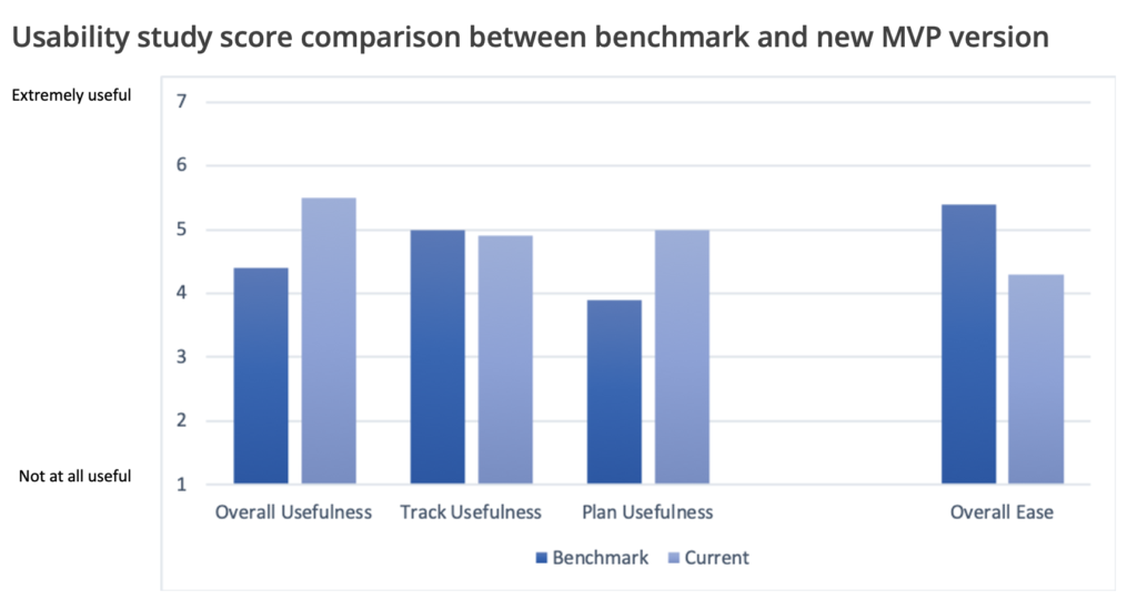
The user researcher conducted a benchmark study and a followup usability study on the MVP version. As suspected, the MVP performed only slightly better than the current implementation, but was trending in the right direction. These studies helped us understand the gaps in functionality and generate a list of use cases to continue enhancing what we had so far.

Graph from research report.

Moving beyond an MVP

With so many possibilities for enhancements and feature add-ons, I knew it was going to be hard to choose where to start. I wanted UX to have a strong case and influence the product strategy. I asked the researcher to conduct a Kano analysis of use cases and capabilities help give PM additional data. This could help us prioritize our use cases and keep us from boiling the ocean.

I wanted to know, from our customer’s point of view:

  • What are the top use cases for a timeline view
  • What are the ideal use cases for timeline view

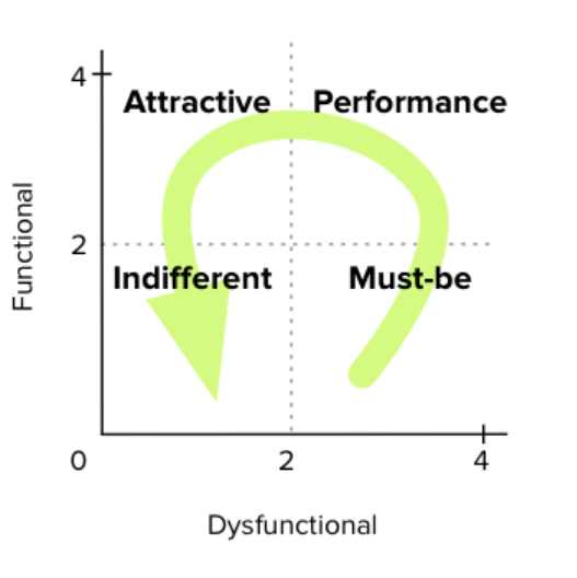
Using the Kano method, we surveyed 100 customers in different roles.

Kano analysis results:

The use cases got categorized into the Kano quadrants as follows.

Must-be

  • Tracking progress of planned work

Performance

  • Planning out upcoming work
  • Communicating upcoming plans to stakeholders
  • Communicating progress of work to stakeholders

Attractive/Indifferent

  • Making edits to an in-progress plan (steering)
  • Creating dependencies between work items
  • Viewing dependencies between work items

The beta version has been live for over 8 months and the front end teams have had their hands full with a UI relaunch so much of this work has been put on the back burner.

I am currently working on UI explorations for the use cases we prioritized with PM after the kano analysis. The next steps will be to create prototypes for any functionality enhancements to test them. I will also work with engineering as they do technical spikes on what the front end library can and cannot do and adjust my designs accordingly.