2017 // Healthgrades
Context:
Challenge:
- The concept was developed in a very drawn out Waterfall-ish cycle. It was passed-off between designers 3 times while at Deloitte and 2 HG designers (including myself). When I joined, user testing had only been done on VERY early iterations. The concept had changed dramatically since it had last been tested.
- A lot of scope, features and pages were trimmed, user testing was cut from the budget.
- Launch date was set to 2 months out from the time I joined, so I couldn’t delay the release with crazy design changes that would impact development.
- Executive management was becoming impatient that the functionality of the app had veered too far off from the “core functionality” of HG.
What I did:
- I ramped up and learned the project and it’s history/baggage quickly while building a relationship of trust with the Product Owner.
- I conducted a heuristic evaluation of the app in it’s current state, my findings and analysis were alarming. My findings indicated imminent failure of the app.
- When the development was far along enough to be functionally tested, I required my cross-functional team (engineers, PO, QA) to take notes and observe during the user tests I conducted.
- The results of the user tests spoke for themselves, I didn’t have to spend much time advocating for a pivot, the team had seen first-hand how unusable the app was and galvanized to take action.
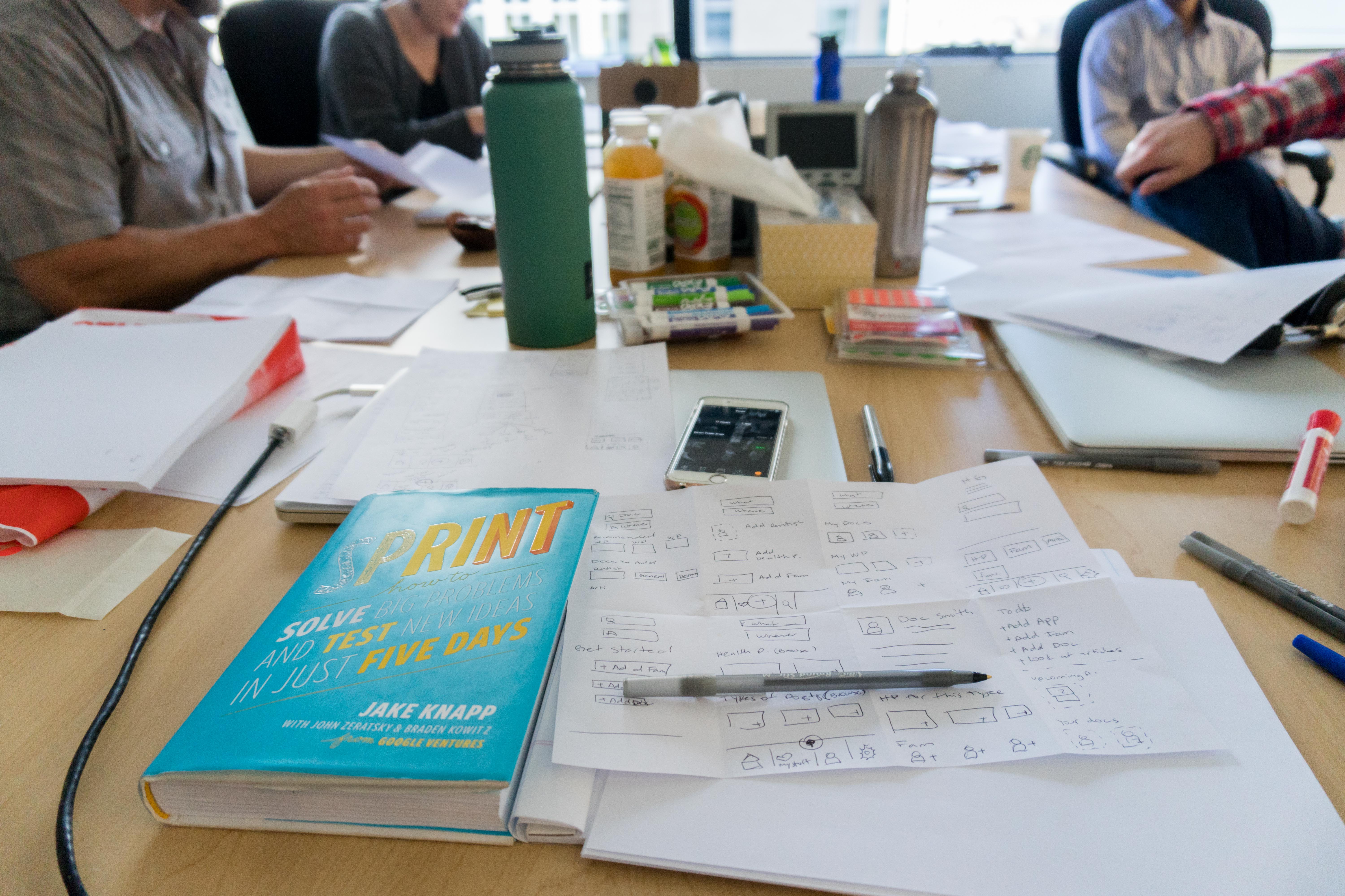
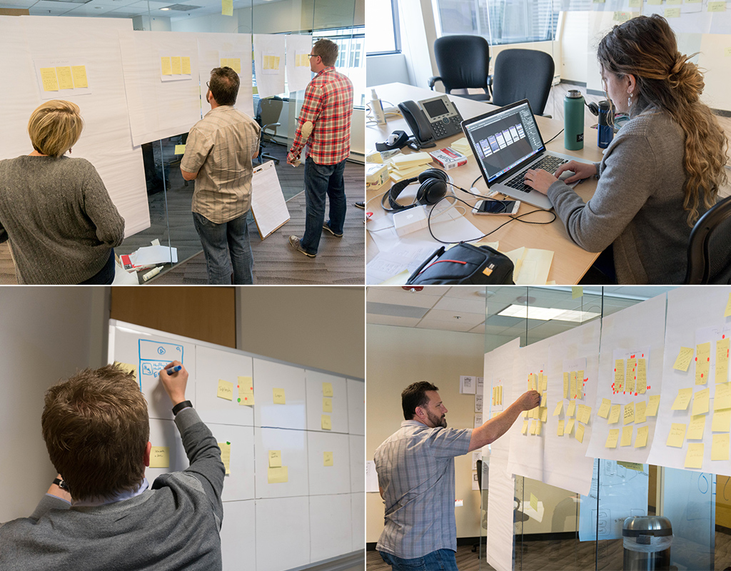
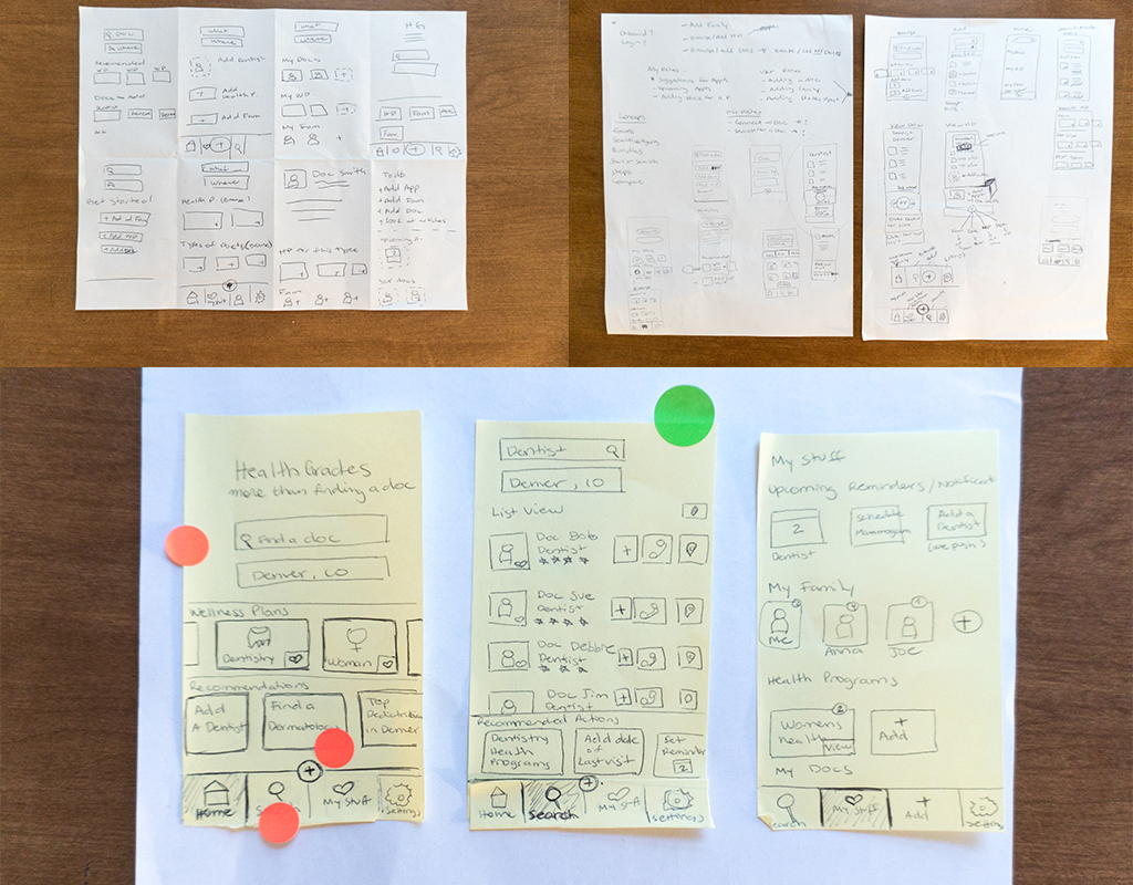
- We decided to use Google Ventures’ Design Sprint process in order to accommodate the need for a high-velocity pivot.
- I facilitated and participated in the Design Sprint to build a prototype that would address usability issues and consider the feedback from the executives.
- We conducted user tests with the new prototype and PoC.
- After Android Launch I shifted towards converting the existing iOS app, which hasn’t had a new release in over a year, to a refreshed UI and set up for parity with the Android version.
Results of Android Pivot:
- Gained full support from executive management as the pivot successfully aligned with HG without having to throw out all development up until that point.
- PoC was better-perceived by users and gave move-forward confidence.
- Improved team mission clarity, communication, and velocity (including improved output and ownership from our distributed team in India).
- Minimal impact to existing code and maximum consumer value improvements.
- Post release: Initial data shows Android conversion rates well above benchmarks at 58.8% for organic traffic in Play Store.
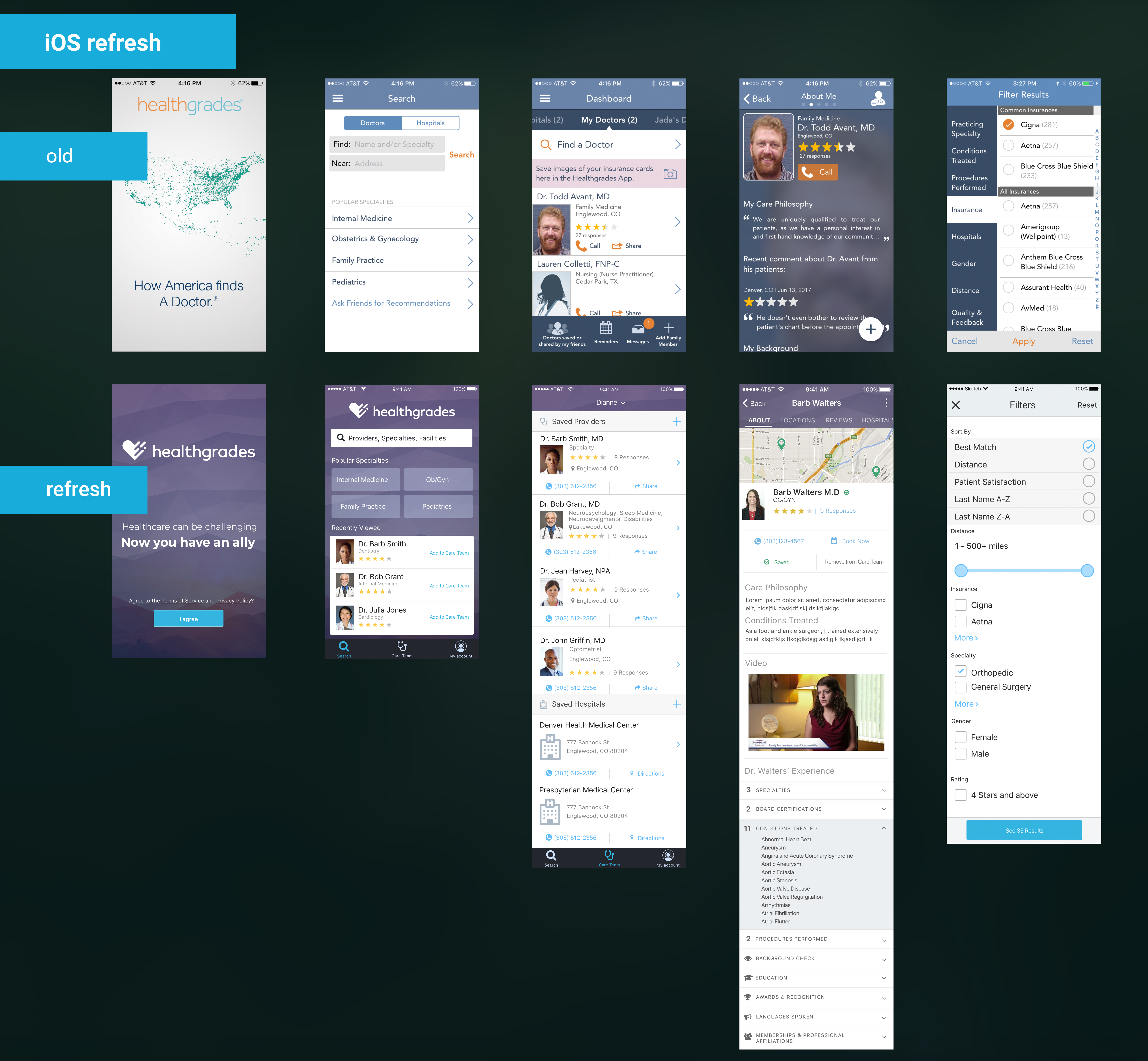
iOS app
Initially the goal was to bring the existing iOS app to parity with the Android beta release, but with changing business goals we decided not to bring in some of the features done in the Android app. I pitched to the Product Owner that instead of ditching any allocated development efforts, we refresh the iOS app with it’s current functionality with a UI re-skin, improve usability and IA changes that would get us set up for (future) parity, but would also add value to the user.
App Store rating 4.6 Stars
Design Sprint Process:
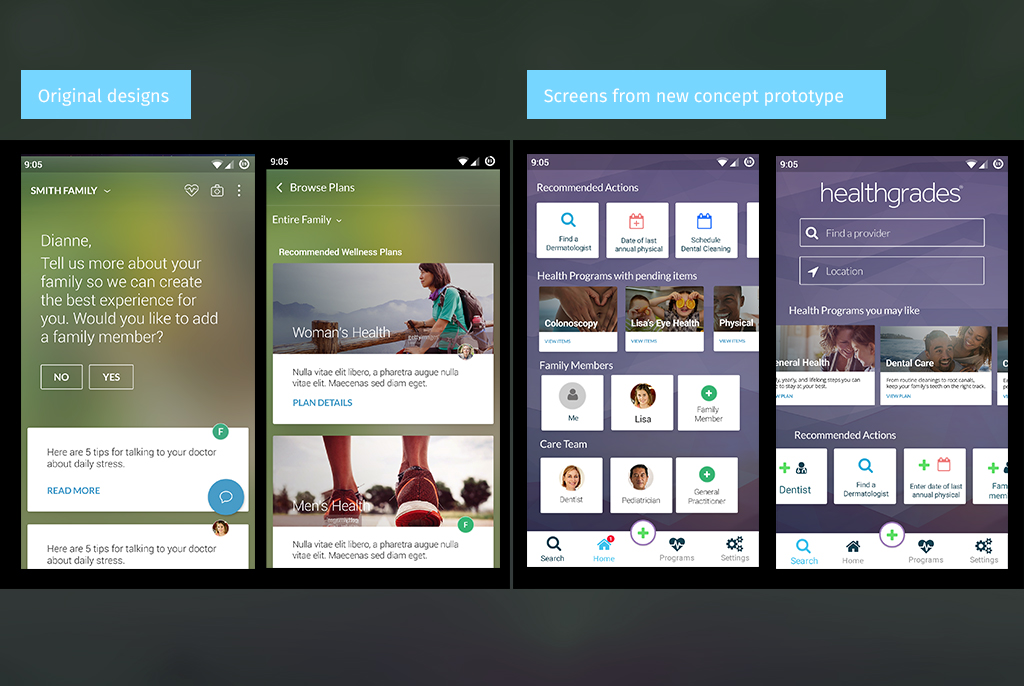
Before and after. On the left screens done by Deloitte, on the right screens from the new prototype.
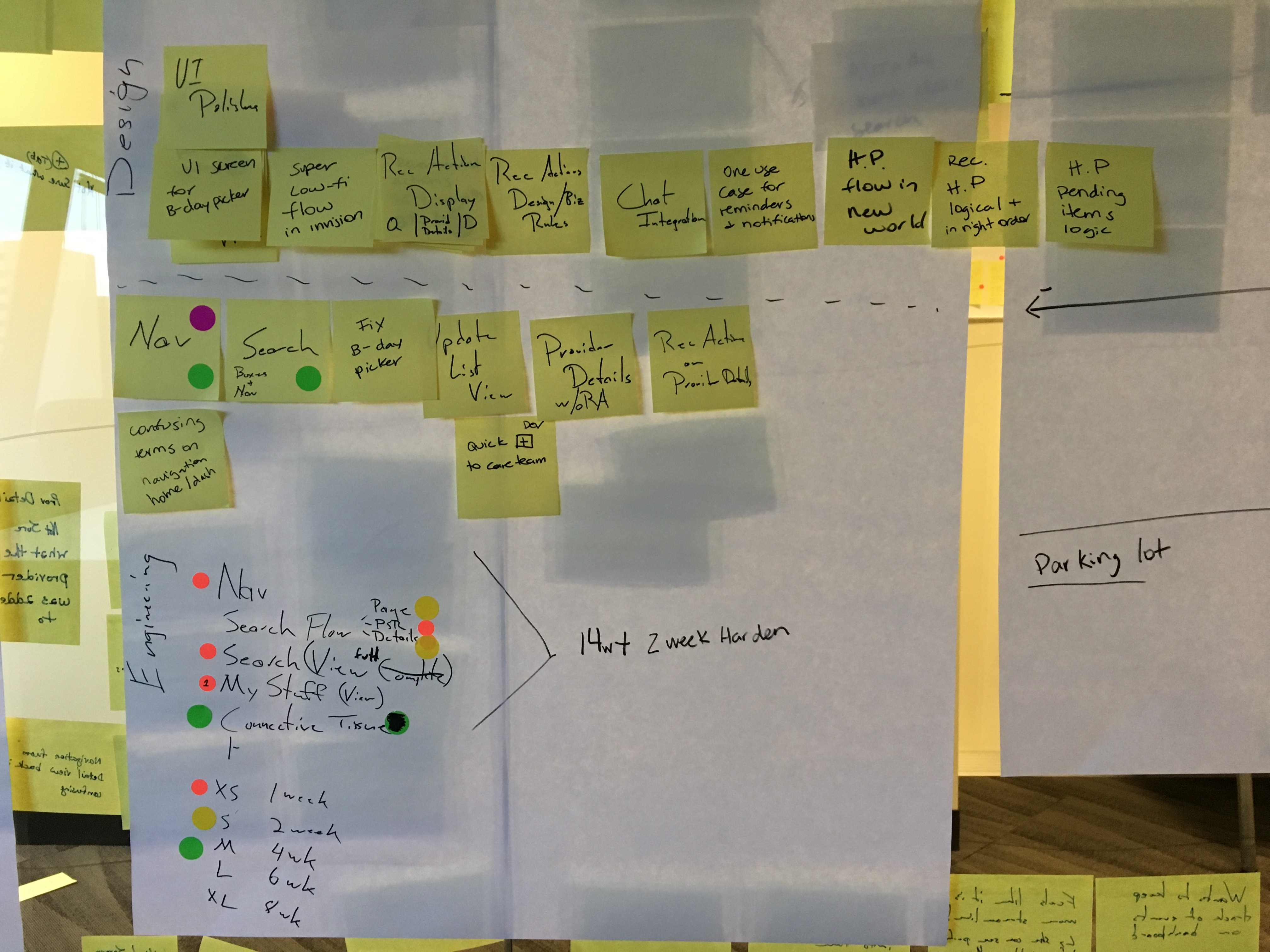
The new direction required adjustments to the roadmap. I lead the team in a very fast prioritization exercise which allowed us to draft a new roadmap with swag estimates for the changes.
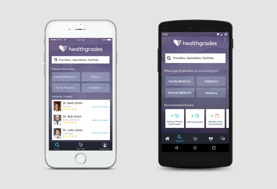
These are a few screens designed after the prototype was tested, gathered feedback and iterated on based on many factors for the beta release.
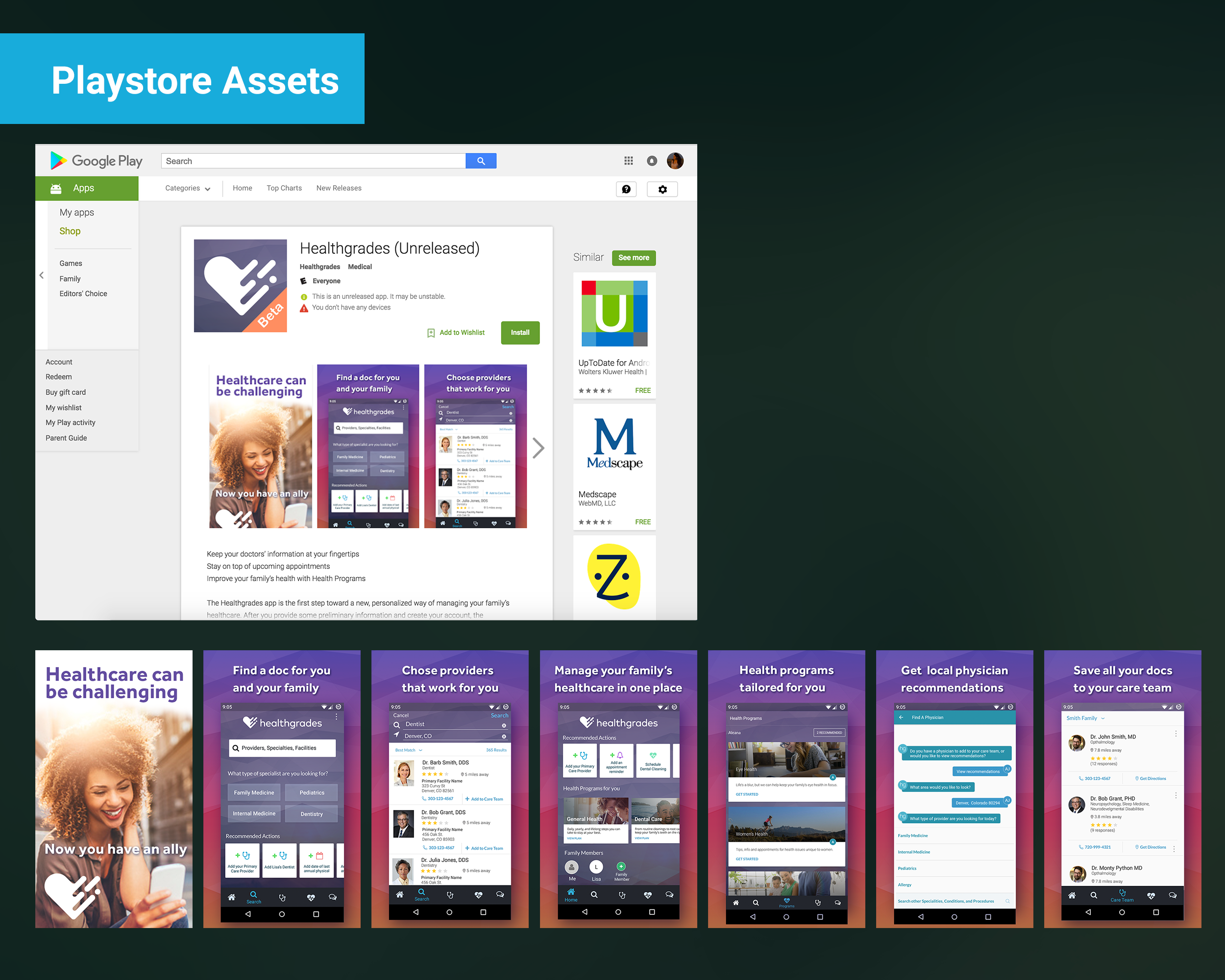
I was also responsible for the marketing materials, I created all the original assets for landing pages, icons and playstore graphics. I also art-directed subsequent assets needed.



Comments are closed.