
2017// Healthgrades
Context:
The revenue from the paid profiles program was declining. The executives asked me to “fix” a list of items they didn’t like about the existing UI. The business wanted to increase calls to the “new patient phone number” and increase online bookings for the profiles who had that functionality.
Challenges:
Initially, the executive team provided me with a list of specific UI change requests. I wanted to take a wholistic approach and use this as opportunity to improve the overall UX of the page. This became the business’ top priority, which meant I had a very short time frame. I worked directly with the CEO and other VP executives, I was able to negotiate a wholistic re-skin that could be implemented quickly because I would make no new functionality or back-end changes.
GOALS
- Simplify content to make more consumable
- Make more CTA’s more actionable and extensible
- Information architecture changes to group content in logical ways
- Keep in scope, no functional or back-end changes
- Increase CTA instances, once per section (appropriate by corresponding profile type)
- Surface as much information as possible (don’t make the user dig for things)
- Use of a grid for responsive and extensible design.
What I did:
- Restructured information architecture and explored ways to optimize content for the user
- Visual Design
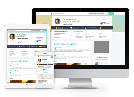
- Incorporated a new grid structure and introduced a responsive design for various formats
- Presentations to the executive management team, including the CEO
Results
- Executive management team called the new design “200% better than the existing design”
- Bounce rate improved by 5% (total traffic to page 70K-100K visits a day)
- Trackable calls went down 20%. Total number of calls to new patient phone number (Healthgrades’ call center)
- Intent to call existing patient number increased 72%
- Quality: New patients conversions went up 3%
- Call center more efficient: non-revenue generating calls went down by 25%
- The project was handed off to a different designer and is currently being iterated on based on changes for SEO and other metrics
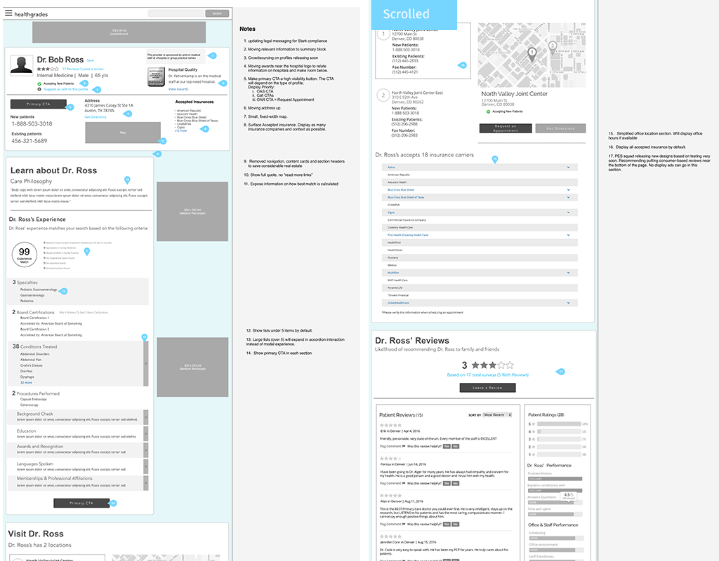
Process:
I don’t normally jump into straight to wire-framing, but I had to move fast. The basic wireframes I presented communicated my over-all intention: to put the user at the center while meeting business needs. I was able to get buy-in from the executives without discussing visuals. Once they approved the Information Architecture changes and basic restructure I was able to move on.
I looked at inspiration and created moodboards and a basic language to communicate my ideas with the Director of Design to make sure I was on the right track to both improve the design but also stay in line with the overall Healthgrades brand.
I created some basic sketches (paper and digital) and iterated to explore how all the content would fit and meet the business requirements.

Quickly exploring different layouts.
I moved on to various explorations of a few different looks and styles.

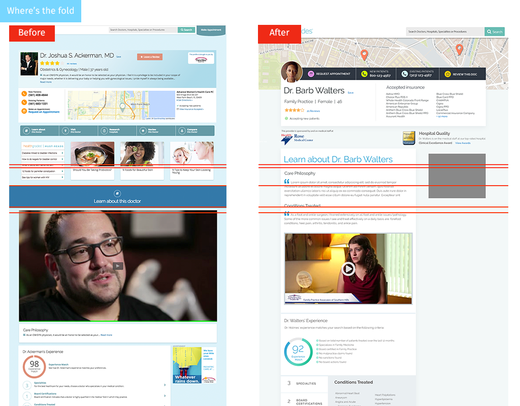
I wanted to surface as much important information to the user as possible. Being very mindful of keeping important info above the fold, especially contact details, basic stats and insurance accepted. I created the “contact ribbon” to highlight all the important business CTA’s and aggregate them in a way that would be easily digested by the user.
Previously, there had been no established grid or responsive strategy, I proposed we take the opportunity to use a 12-column grid and responsive design to improve the experience.

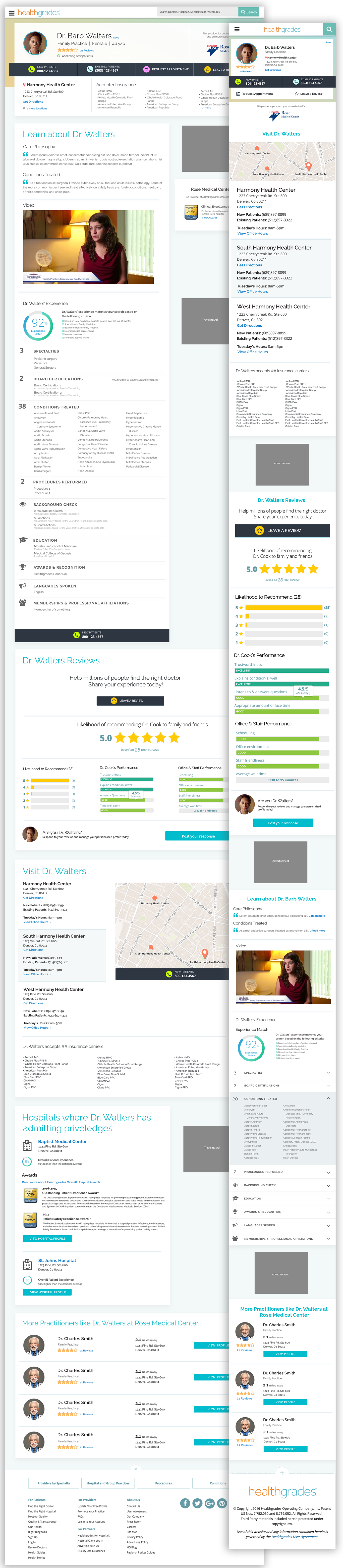
After a couple of presentations and multiple iterations the final solution was a cohesive, beautiful, simple and consumable profile.
Comments are closed.