2014 // The Advisory Board Co.
Context
This was a relatively new product in the suite, it had faced many challenges from its inception. The product set out to be a disrupter of established software in a niche sector in hospitals. I worked on this product for about a year. It was discovered that, for many reasons, the product did not have market fit and was subsequently sun-set.
What I did:
- As a junior designer, I stepped up to the design lead responsibilities and ran all UX considerations on the team. I had to ramp up on the domain very fast. We worked in agile sprints, we released new features every month.
- As I conducted user research, the evidence I gathered was quickly demonstrating why the product didn’t have market fit. For reasons outside of the scope of user experience, the product would never very be useful in that sector of the hospital.
- While I was not responsible for decisions made about the marketing or roadmap of this product, I was still responsible for crafting the best design solutions for the features on the roadmap. While aware of the challenges, I maintained focus on the usability of the experience.
- I worked on information architecture and organized the data in a way that better matched the mental model of the users.
- I worked closely with two product managers and two front-end engineers to collaborate on design solutions. In order to move quickly, I iterated paper sketches and wireframes. I checked in with them daily to get feedback.
- I also worked with product managers to improve internal processes on the team by working on UI assets one release ahead of development so that I was no longer a bottle-neck.
- I scripted and conducted user interviews, usability tests and performed observational inquiries onsite.
Results
- By designing extensible solutions, 6 design patterns were contributed to the enterprise pattern library.
- Successfully shipped new features every monthly release that met requirements and improved the user experience.
- Improved processes that allowed the team to be more productive, my effectiveness lead to a promotion within 9 months.
- An end-user described the UI: “We have a LOT of systems at this hospital. This one I like. It’s the best of any system I use in terms of being user friendly and easy to figure out.”
Process:
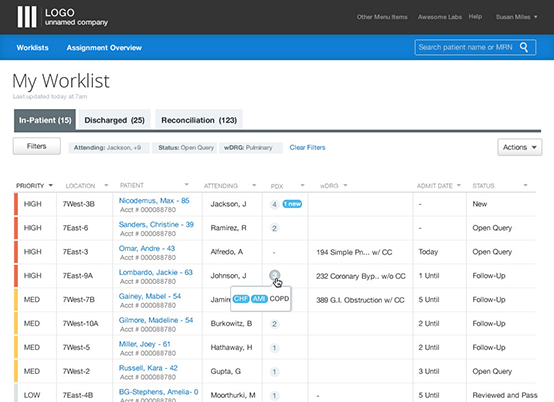
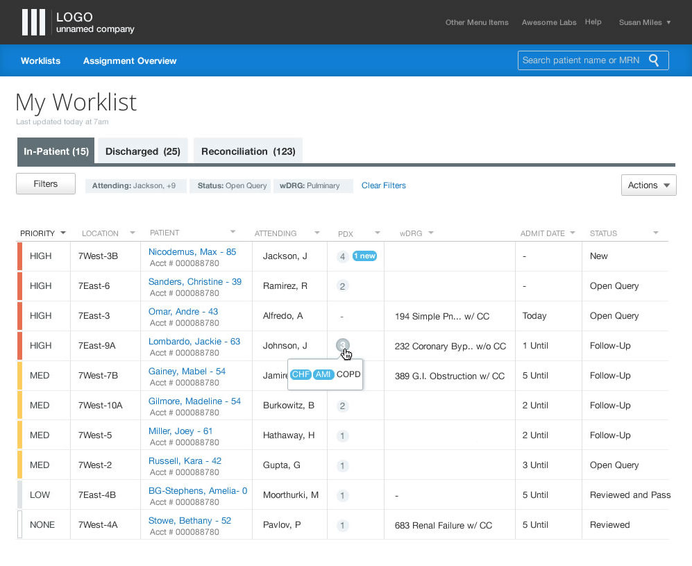
PATIENT INTAKE WORKLIST

Sketching and iterating very quickly.
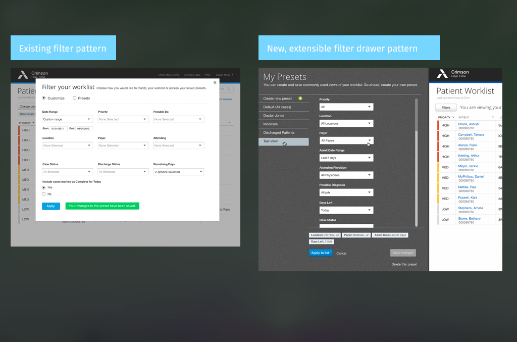
The old modal was not very extensible and it was hard for users to create presets. Users loved the drawer solution because it gave them a lot of room to work.
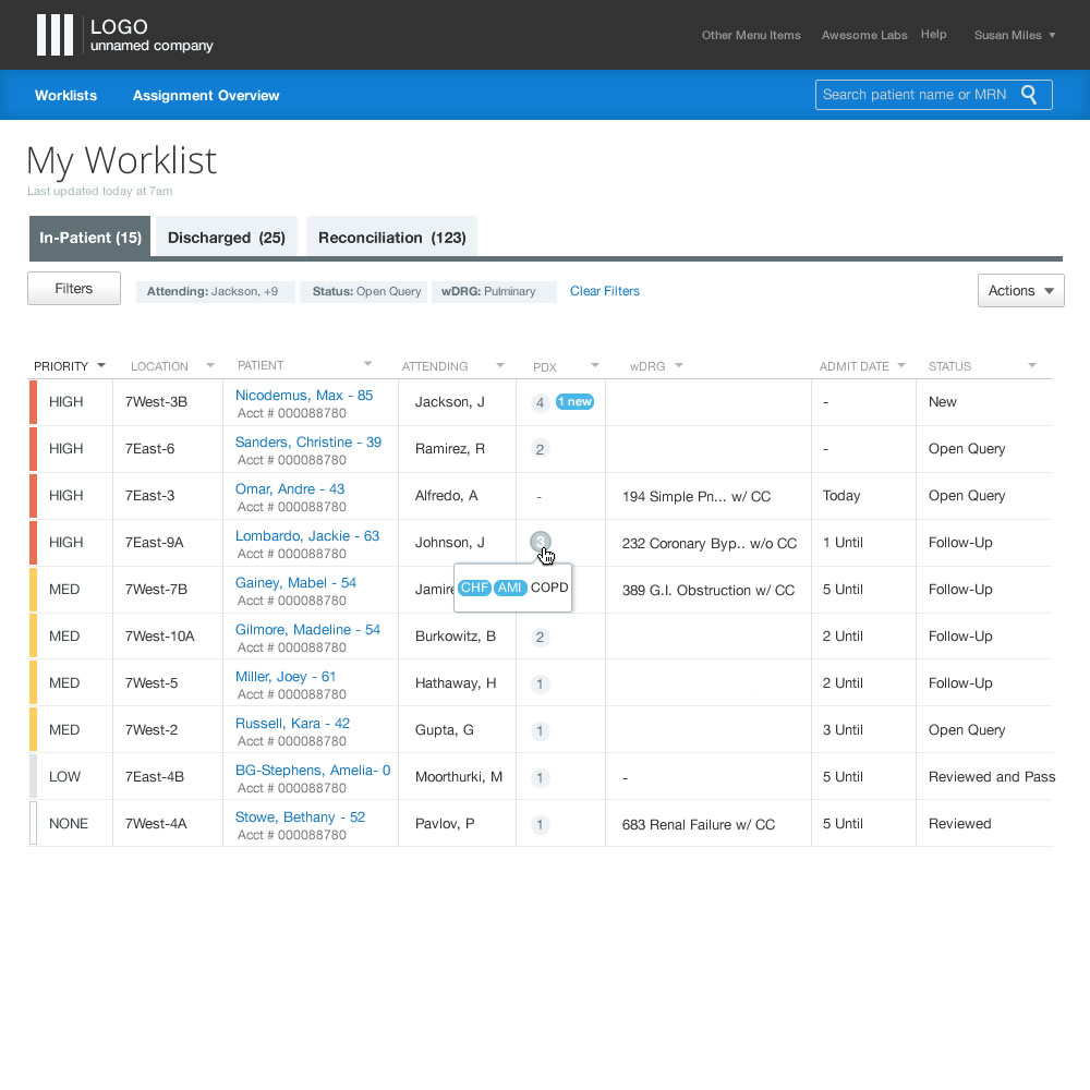
Final UI for the worklist or main page of the application. Produced a simple UI to allow users to focus on the data
PATIENT CASE DETAIL
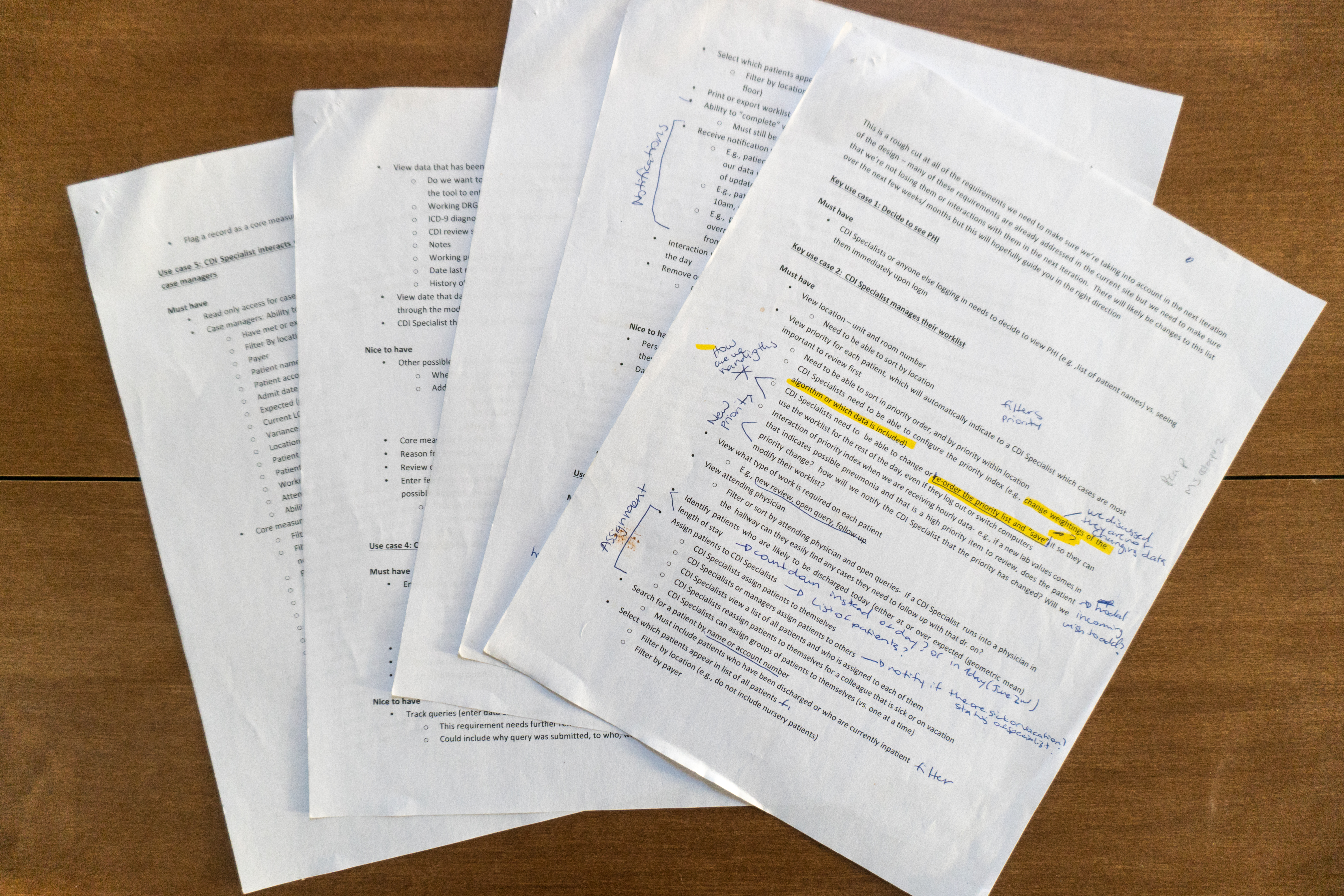
Interpreting a very long list of detailed requirements drafted by New Product Development.
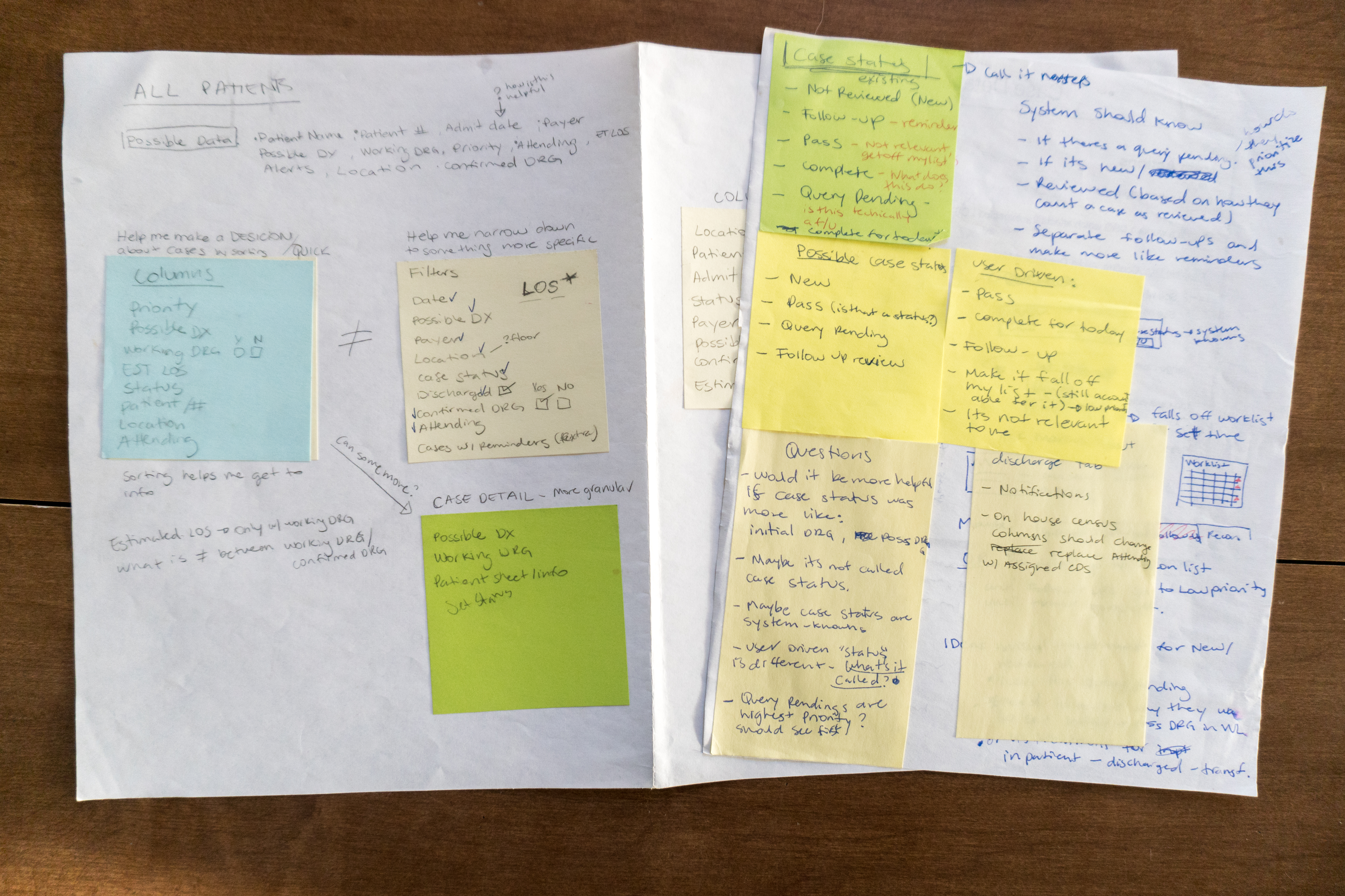
Information Architecture. Making sense of the complex data and making a content inventory. I had to move quickly and document later. Stickies were a quick way for me to organize the information.

Quickly sketching through a lot of iterations for the Case Detail Page

Wireframes for the Case Detail
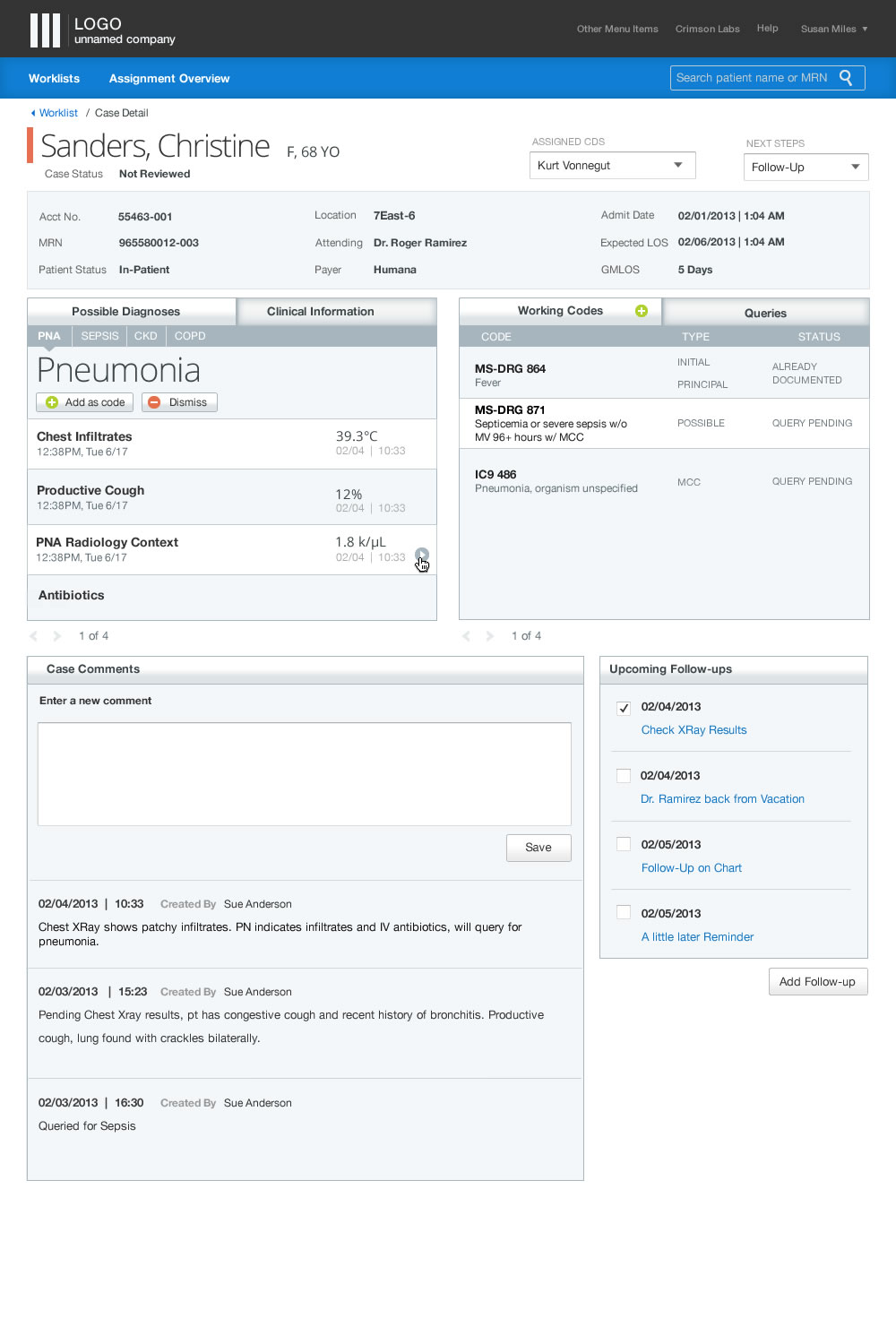
Final UI that followed company style guide.
Comments are closed.