Customer excitement around the new direction is one of the major factors that swayed the CEO of Broadcom from divesting Rally during a recent acquisition. Instead, he has invested in Rally and positioned us as a strategic player in Broadcom’s enterprise portfolio. In galvanizing the transformation of our organization from a feature-driven factory to an outcome-driven organization, laser-focused on the value we provide our customers, Rally was recognized as a 2019 Gartner Leader in the Magic Quadrant for Enterprise Agile Planning Tools.
Rally Product Vision
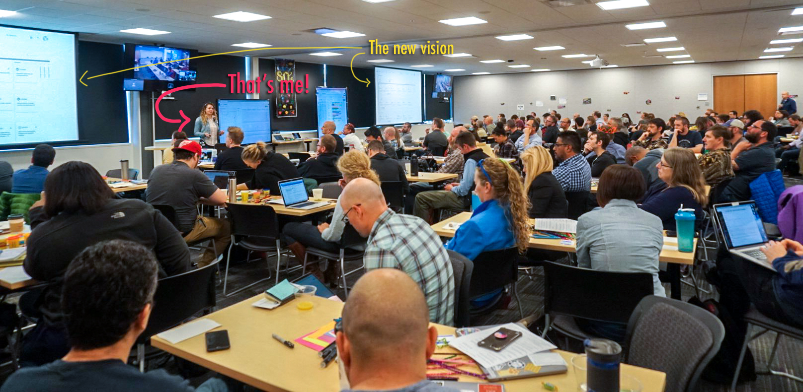 Socializing the new vision with all of R&D and customers during Big Room Planning (quarterly planning event).
Context
Rally software is a $100M SaaS operation with over 1M users in over 100 countries that provides solutions for managing the agile lifecycle process in large organizations with up to 30K users per subscription.
Rally’s business suffered over the last few years; competitors such as Atlassian (JIRA) dominate the team space, and Aha! at the product and portfolio space. Our tool is extremely powerful, but our users complain it’s convoluted, bloated and hard to use. Many powerful features had slow and low adoption.
Challenges
- Legacy tool is 17 years old with a lot of baggage, it lacked a holistic vision, resulting in feature bolting and a convoluted IA.
- The PM org was not accustomed to collaborating, especially with UX. I had to demonstrate the value of involving UX in the product strategy repeatedly.
- Engineering had grown very jaded and frustrated with their lack of ownership of the work.
- Historically, the UX department was treated as producers.
- A difficult acquisition mid-stream of the redesign resulted in a really high attrition rate. Design to dev ratio: 1:46 // UX to PM ratio: 2:16
- Balancing strategic/innovative work with execution level work (pushing pixels), while moving really fast as development teams nips at our heels.
Results
- The demo we showcased at the Agile 2018 conference lead to:
- 208 Marketing Qualified Leads
- 11 Sales accepted opportunities (Pipeline)
- $5MM Projected Pipeline Influence (Objective was $3.85MM)
- Dozens of customers signed up for the Beta release including: Visa, Cisco, ADP, Amex, USAA, T-Mobile, Optum, GE Healthcare, etc.
- Internal product development culture was shifted away from a “feature factory” toward an outcome-driven organization. It’s been radically transformed to be truly cross-functional with a user centered approach.
- UX is now an integral part to product strategy conversations, we are consulted early and often.
My role
I led a cross-functional group of 13 people with 5-7 stakeholders to define a new product vision and strategy. I collaborated with Product Managers to determine clear goals. I led the UX team to define the UX strategy and produce all the collateral that would help sell the new vision along the way. I engaged engineering to build the right thing by arming teams with a bias toward action, and a sense of autonomy and ownership of the goals.
I balanced my time between thought leadership, strategic innovation and design-execution level work. As a result of these combined efforts, the product has been radically transformed; with the user experience being at the center of all the decisions made.
I was hired to lead UX strategy and mentor the design team (2 designers and 2 researchers). The org assembled a cross-functional team to work on reimagining the product from the ground up. I guided this group through processes, frameworks and workshops for 3 months to define a new product strategy based on the business goals and customer challenges. I worked with the UX team to produce deliverables such as workflows, wireframes, prototypes, and mockups. I presented the vision along the way to executive leadership and to the organization as a whole.
Process
Leadership handed the group a match and said “burn it to the ground and build something new,” with the goal of improving subscription revenue, reducing churn, and re-establishing the product as a market-leader.
We started our entire endeavor centered around the user. The researchers aggregated data from customer pain point surveys and NPS, product feedback, and historical product knowledge, allowing us to focus on solutions to customer challenges and pain points, rather than cool ideas that wouldn’t have an impact.

I wanted to strengthen the relationship with Product Management and help them by offering process, I guided them to use hypothesis statements instead of pitching “cool ideas”. Because we had collected and ranked the customer challenges and other data, PM was forced to answer “what problem does that solve for our customer” and if we do, how will we know we are right.
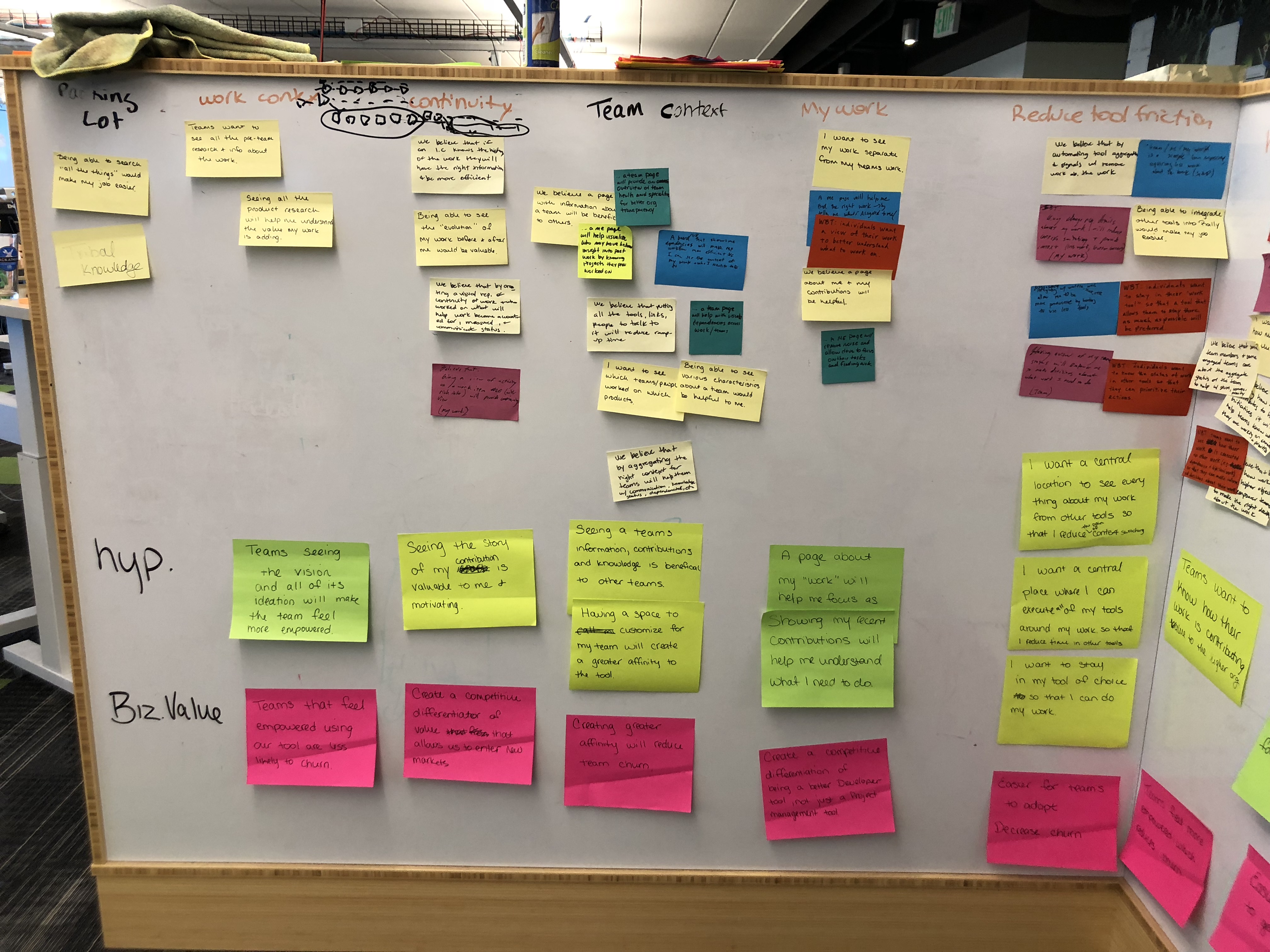
Armed with this data and some Kano-based competitive analysis, we defined a rough MVP of capabilities.
To strengthen the role of UX within the company and mentor the other designers, I led the UX team through multiple exercises to define workflows, concepts, wireframes and prototypes that were instrumental in selling the vision.
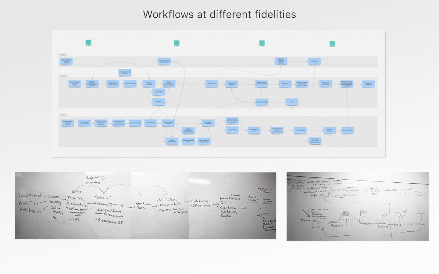
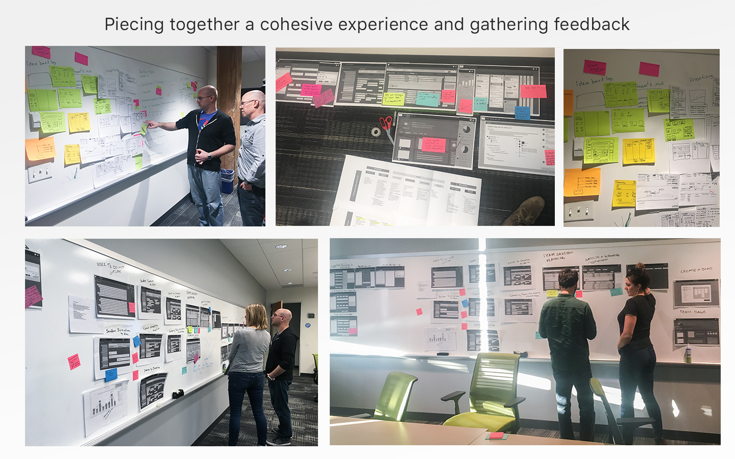

The UX director was empowering me at every step, putting me in the spotlight and giving me the opportunity to grow, which is why I pitched the vision and early concepts to Sr. executive members of the org, and once I garnered their support I presented the vision to the rest of the org.
As I gained trust in the organization, I was able to convince leadership to run 3 concurrent design sprints to validate high risk/high value solutions from our MVP list.

Along the way, as a way to move fast, maximize collaboration and help the small UX team move fast; I co-created a new process called ‘Innovation Sprints’. Its a two-week process that allows small UX team innovate, involve engineering without monopolizing all their time, them during implementation of current work and provide rapid validation.
On a tactical level, the UX team identified one of the biggest challenges with improving the experience of the current tool was how bloated and confusing our users perceived it. We wanted to simplify the tool on all levels: the experience, the technology and our internal tools. We designed a flexible, extensible UI framework that feels light and simple to user but gives them powerful view of their data in ways they prefer.
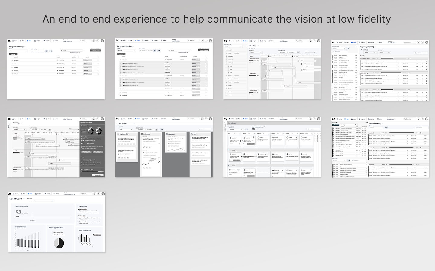
 Wires and flow for the demo developed for Agile 2018 Conference
To improve our code, we would need a way to get rid of dated, slow technology and use modern libraries and tooling. We created consistent, reusable components in order to enable efficiency on all sides. On the design side, we implemented the corporate design system to keep our screens consistent and predictable.
As a team, we created prototypes to communicate the refined vision, the UI framework and front-end components as we continuously iterated.
We designed pixel-perfect mocks (see example) for the entire new set of screens, Rally was the first product under the portfolio to consume the new UI library created by the centralized visual design team.
It was also important to support engineering during the implementation of our new designs during the development of an end to end demo of working software of the new product for the Agile 2018 conference, a very important marketing milestone and sales opportunity.
Since this wasn’t solely a front-end refactor of our tool, it was important to me that I stay involved in the backed decisions being made. In doing so, I influenced the structure and architecture of the new data model and backend in order to allow flexibility to satisfy all use cases that were identified early on.

Currently
- As sole designer at Rally, I balance my time to simultaneously design execution level work and strategic and innovation ideas; all while moving fast for 4 development teams. I also iterate designs based on user test findings with our beta customers.
- Negotiate with Product Management on ruthless prioritization and order of initiatives (feature capabilities) in order to meet our launch date but also satisfy our customers’ needs.
- Support dev teams with their implementation of designs.
- Collaborate with the user researcher on test plans
- Inform what will get into the research track for the user researcher to test, for both long-term conceptual understanding and immediate validation and usability testing needs